
A Course of Instruction On How to Make Business-Building Show Cards
By JOHN H. DeWILD

Prepared for the
EDUCATIONAL DEPARTMENT OF THE
ASSOCIATED ADVERTISING CLUBS OF THE WORLD
New York, N. Y.
Copyright 1923, by John H. DeWild
It is with pleasure that we present this text on Show Card Writing by Mr. John H. DeWild of St. Louis.
It is designed primarily for the use of the study classes in the educational work of the Advertising Clubs that comprise this Association.
It is built out of the practical experience of a class that Mr. DeWild has conducted with success in the Advertising Club of St. Louis. In fact, the publication of the book has been somewhat delayed owing to changes that have been made in the original plan; changes that have greatly added to its practical value and that have come out of Mr. DeWild’s experience in his advertising class.
It should be mentioned that Mr. DeWild is the manager of the Merchants’ Service Department of the Ely & Walker Dry Goods Co., St. Louis. He has written books before on this subject. Being a practical merchandise and advertising man he knows the sales and advertising value of properly made show cards. He understands the technique of show card writing perhaps as well as any man in the country.
This is one of a series of texts prepared for the Educational Committee of the Associated Advertising Clubs and it is hoped by the Committee that it may serve an important place in improving the quality of show card writing and its advertising and sales value throughout the stores of this country and of Canada and of every country where an Advertising Club is located.
EARLE PEARSON, |
PAUL T. CHERINGTON, Chairman |
Associated Advertising Clubs of the World.
The ten practical lessons which follow, together with numerous supplementary alphabets and showcard suggestions, are the result of careful study, based upon years of experience gained in teaching the simple fundamentals of showcard writing to various groups of merchants and employees, demonstrations before Retail Merchants’ Associations, conventions and in other educational work.
The lessons were formulated into the course recently inaugurated under the direction of the Educational Committee of the Advertising Club of St. Louis. So successful was the course that this book has been prepared with the idea in mind not only to serve as a text book for instructors, where it is desired to conduct classes under the auspices of an Advertising Club, but also for the student or store employee who desires to do individual practice outside of a classroom. This is the only text book published which carries the student forward, lesson by lesson—in a simple, practical manner. (Note the charts for beginners).
It is easy to acquire, in a very short time, the ability to do suitable showcard work, provided the student first of all masters the fundamentals of lettering.
By “fundamentals” is meant the simple strokes that form most of the letters, and these “strokes” should be mastered to the extent that they will always be made uniformly.
In lesson No. 1, these fundamentals are thoroughly explained, and by using the large charts which are original with the author, the student will readily grasp the idea of properly forming the letters. With the first lesson thoroughly mastered, the remaining lessons will be very easy.
The author is grateful to the Advertising Club of St. Louis for the inspiration—and the opportunity which led to the demand for a course in card writing. For many original ideas and suggestions used in the class-room, and for several alphabets and showcards, a great deal of credit is due Miss Frances Kaiman and Mr. Charles Jones, both of St. Louis, who gladly gave their services during the original course, and also in the preparation of the text itself.
Experience demonstrates the fact that classes of this kind are made up of students from all walks of life; many of them without experience, and the majority of these young men and women come from the smaller stores in outlying districts.
For this reason, it is necessary in class work, for the instructor and assistants to render personal service to the extent that each student is encouraged along the lines he or she prefers.
As an illustration: The young man from a drug store is interested in vastly different styles of showcards than the young man employed in a grocery store, and after the primary lessons are completed, it is best to prepare suitable copy and layouts for the students, so that each may work along practical lines.
On the pages following the lessons will be found many showcard suggestions for numerous kinds of business, and various seasons, all based upon the alphabets shown in the lesson plates.
Secure the proper materials right at the start. Improper materials are a handicap.
Instructors who undertake the classwork in many of the smaller cities and towns, as well as individual students, will perhaps experience some difficulty in securing the right materials. If, after investigation, such is found to be the case and the suggested materials mentioned on this page are not procurable in quantities sufficient for individual or class practice, the Educational Department of the Associated Advertising Clubs of the World, 383 Madison Ave., New York, will be glad to furnish these materials at very low cost.
Proper materials are necessary, and good work can be done only when the student is provided with the best.
For the beginner, the following outfit is suggested:
1 set of 5 sizes round speedball pens,
1 set of model “C” speedball pens or several sizes of broad pointed pens,
1 bottle of black drawing ink,
1 No. 10 and 1 No. 12 red sable “rigger” showcard brushes,
1 2-oz. bottle black showcard color,
1 2-oz. bottle light red showcard color,
1 “T” square,
1 drawing board at least 22×28 inches,
A supply of thumb tacks.
The “T” square may be “homemade,” if necessary, as well as the drawing board, the only essential in the drawing board being that it be “squared up” on two sides—the left side and bottom, thus enabling the student to do rapid, accurate “lining” or ruling.
With these materials, the student is ready for the first lesson, which should be practiced with the aid of the large instruction sheets, these charts being provided by the Associated Advertising Clubs, and two of each are included with this text book.
It is also suggested that where the local Advertising Club or other organization is fostering the class in showcard writing, there should be provided extra charts for practice, together with sheets of heavy paper, enameled on one side, size 14×22 inches. This enables the student to do extra practice in addition to the chart work itself.
In purchasing showcard stock, students should keep in mind certain sizes of stock necessary.
Full sheets of cardboard are 22×28 inches.
Half sheets are 14×22 inches.
Quarter sheets are 11×14 inches.
Eighth sheets are 7×11 inches, and so on.
The thickness or “weight” of cardboard is usually designated by the term “ply” which means the number of layers of rough pulp making up the body.
A good weight for ordinary cards is 6-ply.
Heavy board, usually used for half and full sheets, is 10-ply, or thicker. Mat boards and double size cardboard usually come 28×44. Some mat boards and other fancy boards can be procured, however, in 22×28 size, thus saving the time in cutting.
It is suggested that students procure from their printers or wholesale paper houses, catalogs of samples and sizes of the various cardboards, etc., and familiarize themselves with the weights, colors, names, etc.
If the showcard work is to be conducted in classes, it is highly desirable to procure a suitable room where drawing tables are available; for instance, the drafting room of a high school or college. If this is impossible, the next best method is to provide large tables, slightly lower than thirty inches, and chairs where students may sit at their ease, in using their drawing boards.
As the work progresses, the tables should be raised, so that those who desire may stand up. This will enable the students to do better work, especially when the brush work is being practiced.
In fact, it is suggested that after the third lesson students be permitted to stand as they work, and if in a drawing classroom or showcard studio where practical work is done, the regular drawing tables can be used.
The thorough mastery of the fundamentals is absolutely essential to good work, and particular care should be taken with the first four or five lessons that all students master these details. If the student is without an instructor, he should exert every effort to be painstaking, and never hurry the work in the early stages of practice.
Quick, “jerky” strokes, especially with the pen, are decidedly bad form, and should never be attempted until the student has advanced to the point where it is possible to gain a little speed and yet be neat and accurate.
The instructions on the practice charts, as well as on the following pages, regarding the early lessons are fully explanatory.
There should be absolute silence in the classroom, and students should be so arranged that the instructor and assistants may pass rapidly from one chair to another, watching each student, and making corrections wherever necessary. The instructor should provide himself with a pen or brush as necessary, and use a separate sheet of paper in showing the students the correct method of making certain letters. Students need suggestions particularly on the formation of the letter “C,” the letter “S,” etc. Once the “reason why” is mastered, the rest is easy.
Students should assume an easy, comfortable position. A cramped position is hard on the muscles and nerves, and ruins the eyes. Keep the head well over the work and have the work in front of the body—never too far toward the right.
Don’t be afraid to “bear down” on the pen—pressure will keep the hand from “wobbling.”
Keep the third and fourth fingers “folded in” and permit the hand to rest comfortably upon the table or drawing board. Use the thumb, first and second fingers to hold the pen or brush firmly and do as much of the work as possible with these fingers. In other words, “loosen up” the wrist and fingers.
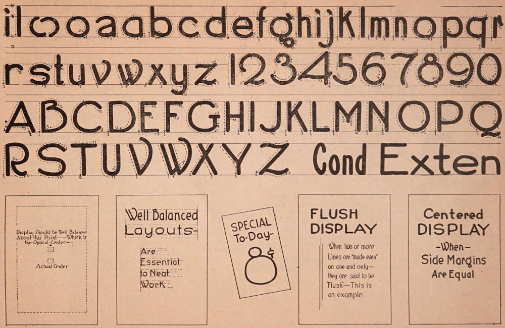
On the adjoining page is shown the plain speedball alphabet, one of the simplest alphabets that can be formed. The light lines show the direction in which the pen should move in forming the letters, and the numerals indicate the order in which the strokes should be made.
Keep the “foot” of the round speedball pen flat on the surface of the paper or cardboard and press down with considerable force so that the pen makes a full, even stroke.
Do not carry too much ink, as it will run and spoil your work.
Practice slowly and patiently.
Learn to form carefully the “lower case” or small letters, “i,” “l,” and “o.” All of the “lower case” letters containing ovals should be of the same uniform proportion.
In this alphabet the “O” has been formed as a perfect circle, thus giving the student something definite to work from. It will be noticed that a-b-c-d-e-g-o-p and q contain ovals which must be uniform. Also notice that the lower case letter “i” is the first stroke in the letters “m” “n” and “r,” and with a slope, is used in the construction of u-v-w-x and z, and that the letter “l” is the first stroke in the letters “b-h-k and p”; thus the formation of an alphabet requires very few strokes.
It is also well to bear in mind that the experienced showcard writer does not “work” or think in terms of letters, but his mind works in terms of “strokes”; thus he knows when forming the lower case letter “b” that the first stroke will be exactly like or similar to the lower case “l” and then must be added the oval.
The capital letters are made up of uniform strokes, and the same with the numerals. It will also be noticed that wherever there is an oval, it should be as nearly the form of a circle as possible. The “oval” in figure “2” if continued would be a circle. The figure “3” is the same as figure “8” except that in “3” the ovals have openings. The loop of figure “5” should be almost a complete circle, the same as the loop in “6” and the lower loop of the numeral “8” should be the same size as the loop in “9.”
The ovals of the lower case letters should be of a proportion that will occupy the space between cross lines “B” and “C” shown on the chart. After a little practice on the charts, and in the first lesson omitting the spurs entirely, this alphabet will be easily mastered.
It will be noticed that the ruled lines on the chart are numbered A-B-C-D. This is for the convenience of the student, with the idea in mind that the ovals of the long stem letters are two-thirds total height. That is—the space from line “A” to line “B” should be one-half the space from “B” to “C” and the space from “A” to “B” should be equal that from “C” to “D.”
This is an excellent proportion for practice work, although the student after he progresses is at liberty to vary these lines as may appeal to his fancy. (See page of speedball “variations” following lessons).
By “spurs” is meant the little cross finishing lines as shown on the chart. Omit these “spurs” during the use of the first two or three charts.
In lesson No. 1 follow on the chart only the lines indicated on the following page.
Then carefully study the layout suggestions—where the “balance” of display comes—and the various arrangements.
Fundamentals
Plates used by permission of Ely & Walker Dry Goods Co., St. Louis.
This lesson, shown on following page, should not be attempted until LESSON No. 1 has been thoroughly mastered.
The student should be familiar with the layout suggestions shown beneath the alphabet in lesson No. 1 even to the extent of laying out the same outlines and copying them on sheets of paper about 9×12 inches.
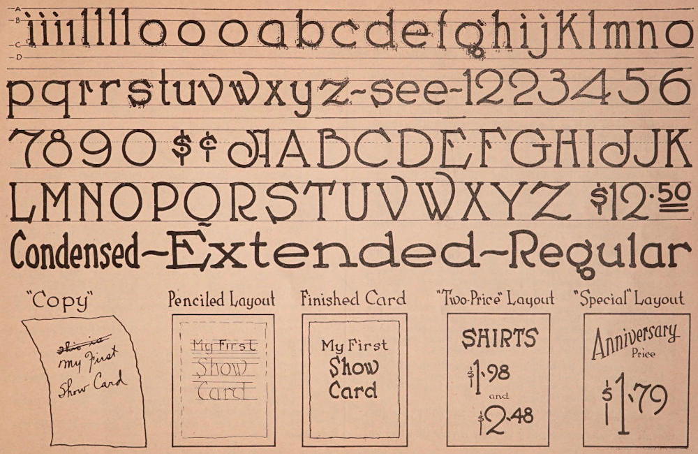
Lesson No. 2 should be copied by the use of a No. 3 round speedball pen. Follow the dotted lines on the chart very carefully and observe the details—especially the “spurs” which are the little finishing touches or cross lines—these being purposely omitted in the first alphabet.
When the student has carefully lettered in one or two of these charts the same alphabet should be copied on a plain piece of paper or cardboard, forming the letters as nearly perfect as possible.
Use a pencil for the “ruling in” on practice paper other than the charts.
Page 7 also shows the condensed and extended variations of the alphabet. Keep these forms in mind. Condensed lettering is often necessary on narrow cards, and the extended is often used on very wide or “landscape” sizes.
With this lesson thoroughly mastered—the student is advised to practice the layout work. The first drawing suggests the “copy” for a showcard as it is often handed to the card writer.
There is a rule in card writing which demands the elimination of useless or unnecessary words. Thus the student scratches out the words “this is.” These words can be eliminated without changing the sense of the card. Next, take a piece of enameled cardboard, or enameled paper, and make a penciled layout as shown.
Keep the balance of display toward the top center. Note that the three lines are “gathered” in a group—not scattered all over the card.
With the penciled layout ready—take up a No. 3 pen and letter in the first line—then use a No. 2 pen for making the next two lines. Use the smallest pen for forming a rather wavering or “rugged” border about one inch inside the margin of the card. Note the reproduced finished card shown.
This layout should be practiced until it resembles the original. Then the student should attempt the next card known as the two-price layout, and then follow with the special arrangement.
These three layout suggestions will give the student confidence and the knowledge gained from practicing will make other layout work much easier.
During the intermission between lessons, possibly covering several days, the student should lay out and letter in other showcards from original copy or from copy suggestions secured through observing the showcards in large stores, or from the advertisements in the newspapers.
Master the alphabet and practice.
Success follows persistent trying.
Perfected Speed Ball Alphabet—Layouts
Plates used by permission of Ely & Walker Dry Goods Co., St. Louis.
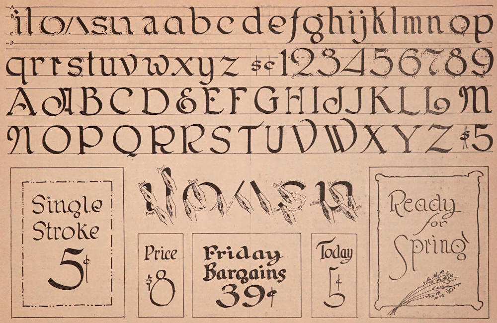
This is a very beautiful alphabet when properly made. Students should note the graceful curves—and practice each letter carefully and faithfully from the large charts.
The alphabet reproduced on the opposite page is from the same copy as that used in making the practice charts, with the exception that in the book, the practice lines are omitted.
Any “broad pointed” pen may be used for this alphabet. Some showcard writers prefer the model “C” Speed Ball pen, others prefer what are known as “round” writing pens—which are the same style pen as the “Soennecken,” others may prefer the “Automatic Lettering Pens.” Any style pen that will fit the practice lines will suffice. The original chart from which the illustrations were produced, was made with a No. 3 model “C” Speed Ball pen.
In beginning the practice work, note on the charts, and also on the alphabet shown here, that the four guide lines are lettered A-B-C-D, just the same as in the first and second lessons. The spacing is the same, and there is a general proportion common to both alphabets.
Hold the pen firmly, but the hand should guide the pen at a slight angle. In other words—keep the hand somewhat farther toward the right of the letter itself—rather than directly over the work as was the case with the round Speed Ball pens in the first and second lessons.
Note carefully the sketches shown beneath the alphabet—and endeavor to hold the pen exactly as shown. Note particularly the angles in which the pen travels in starting and finishing the various strokes.
In making the “staff” strokes such as “i”, “l”, etc., the pen should make a slight upward curve—much the same as though the writer were going to draw a very thin line upwards at an angle of about 45 degrees. When this thin line is fairly started and touches the guide line, then make a graceful curve and come directly downward almost to the base line, allowing for the slight curve at the bottom of the stroke.
Try the letter “i”.
Hold the pen at an angle. Come up slowly, then turn and follow the practice lines downward. Then try the letter “l”.
Now take a separate piece of smooth paper. Rule this off into spaces the same as the practice chart, and continue making the letters “i” and “l” until the pen feels “natural,” and you can make perfect perpendicular lines with the graceful curves of “spurs.”
With the pen “sliding” downward somewhat at a cross angle, the wide downward strokes will be found easy.
Then try, on the chart, the curves which enter into the making of the letter “o.” All such curves are made from the top downward, and this is an important point. Also remember that there must also be a swing of the pen from LEFT—DOWNWARD. Then, TOWARD THE RIGHT—AND DOWNWARD. Two strokes form the letter “o.” The next strokes are simple.
With the letter “s”, you must use “THREE” strokes. Note the chart.
Then come the strokes with curves which enter into the construction of “h”, “m”, “n”, “w” and “y”.
Bear down on the pen sufficiently to get a wide stroke.
Use a sweeping motion to get the curves.
Follow faithfully the outlines on the chart, and you will soon be able to make a beautiful alphabet.
The capitals are a series of easy curves, also the numerals.
Broad Point Pen Single Stroke Roman
Plates used by permission of Ely & Walker Dry Goods Co., St. Louis.
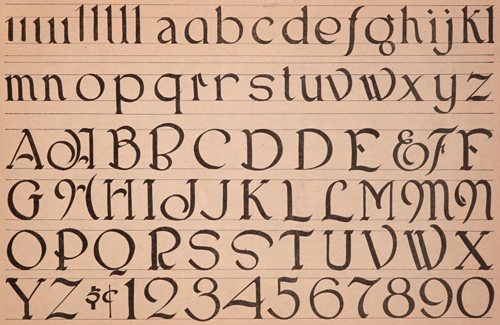
The student is now ready for practice work without the aid of charts, except for the model shown on adjoining page.
Use either a No. 10 or No. 12 “Rigger” showcard brush.
Rule the practice paper so that the total height of the letter “l” will be about 2¼ or 2½ inches. This will leave a space of about 1½ inches for the ovals. Any size letters, however, may be made providing of course the brushes will accommodate them. Be very careful in choosing brushes, and get good brushes. Professional card writers prefer the best red sable obtainable, and with reasonable care, a good brush will last a lifetime. Also be sure of the sizes. Brush numbers are confusing, and there is a series of sizes larger than the “Rigger,” with duplicate numbers. The term “rigger” means the short handled brush, and this style brush also has somewhat shorter bristles than the larger models. The price of the “rigger” is also considerably less than that of the larger brushes. If there is difficulty in securing brushes, write to the Educational Department of the Associated Advertising Clubs of the World, as suggested on page “Materials for Beginners,” and you will be properly supplied at reasonable cost.
The student must also use regular showcard color for ink. Don’t use pen ink for brushes. It will not work, and is too expensive. Procure some regulation showcard colors in the 2-oz. bottles costing about 25c. Professionals use the term showcard “colors” to designate the brush water colors from the inks used for pens.
With the brush and ink ready—secure a small piece of cardboard for use as a palette or mixing board, and by dipping the brush into the showcard color several times, there will be sufficient quantity on the palette to proceed. Have a small cup of water handy, and into this dip the brush for moisture. Pour very little water into the show color itself—moisten and work up the color on the palette.
In doing the “mixing” also endeavor at the same time to work the bristles of the brush into a sharp “chisel” or flat edge. This is necessary to do good work.
After each letter or two, repeat the chiseling out strokes on the palette, and always carry sufficient color on the brush to do good and easy work. Don’t permit the brush to dry out so that the letters are weak and poorly “covered.”
Now for the lesson. Hold the brush with the point at an angle—the same as the pen was held, in forming the alphabet in the previous lesson. The first stroke is a very short, light one—then, rest the brush, and bear down slightly until the bristles are well spread. Come down in an even, straight stroke. This is the first stroke. (See first stroke on next page). When almost to the base line, stop and go back to the thin spur, and fill in the open space. (Note the second stroke on next page). Then resume position as in downward stroke and taper easily and slowly toward the right, touching the baseline. (This is stroke 3). Next place the brush a trifle from the bottom and come downward to left. (Making stroke four). Then across the bottom of the line, completing a very neat spur with stroke five.
This is the manner of lettering the lower case “i” and also the lower case “l.”
Close observation will show the exact manner of finishing “off” the capitals. In the practical use of this alphabet, avoid using lines of all capitals as much as possible—and then, use only the simple capitals. The fancy letters are for use only as the first letter on a showcard or for capitals in the main display lines. It is difficult to read lines of all capitals at a glance, and for this reason they should be used sparingly.
In doing color work, students will find that regular showcard color, somewhat “thinned out” with water, and placed in a separate bottle, will serve admirably in pen work. This is particularly true in lettering with the pen, on mottled mat board, or other “pulpy” surfaces.
BRUSH “ROMAN”
Plates used by permission of Ely & Walker Dry Goods Co., St. Louis.
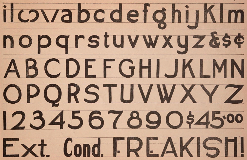
Show card writers give this alphabet the name “Egyptian” when it applies to the plain lettering as shown on following page. There are many other names that apply—when the alphabet is “trimmed” up with various embellishments known to professionals. There is the spurred “Egyptian” when the lines are finished off with “spurs”—either heavy spurs or hair line spurs, and a host of other “embellishments” according to the taste and originality of the card writer.
The student will do well however to stick to the plain alphabet until the various letters are thoroughly mastered.
Among printers, this alphabet is known as “Gothic,” and some showcard men call it a “block” letter. The term “block” comes from the fact that most of the letters should occupy the same amount of spacing.
While not a beautiful alphabet—it comes in very conveniently, and is a splendid letter for making bold lines. As an illustration—the word “HATS” is a comparatively weak word on a large show card, unless the lettering is heavy, or embellished with some shading or outlining. With a broad brush—if in a hurry—the card writer can dash off such a word very quickly in “Egyptian”—thus saving time, and yet making a good, bold card.
The word “HURRAH”—sometimes used to attract attention—is very weak—unless lettered in bold “Egyptian.”
Large prices on full sheet cardboard signs and letters on cloth signs are also often done with this alphabet.
Don’t be discouraged when first attempting it with a brush—and make it only with the brush.
Pick out a brush that has a good even edge. A “ragged” brush is useless for heavy strokes. And when you find a brush that will work well, leaving the perpendicular and ends of the vertical lines even and neat, KEEP SUCH A BRUSH FOR THIS STYLE LETTERING, and use it for nothing else. In contrast to the “Egyptian”—a brush for the Roman alphabets must be pliable and of a “texture” to permit of light and heavy lines being made alternately.
In forming the “Egyptian” the brush must hold its “chisel” edge, and keep an even stroke; therefore the necessity of using the right brush.
First practice the letters that contain the straight strokes, E-F-H-I-L-V and W. Keep practicing these capitals until they become easy. Then take up the remainder. For the capitals—draw your cross guide lines about two and one-half or three inches apart. Regulate your lower case letters accordingly.
Learn to twirl the brush between the thumb and second finger, using the first or index finger as a sort of guide to keep the brush in place.
Roughen up the polished ferrule of the brush with sand-paper, or a file. Some showcard writers wrap adhesive tape about the ferrule, others wind that part of the brush with small rubber bands. All these “tricks” enable you to hold the brush more firmly and make the “turns” much easier.
Making the curves is a combined arm, wrist and finger movement and the student must bear in mind at all times that the hand must drag the brush. Do not try to push the brush. KEEP THE HAND AHEAD OF THE BRISTLES, and keep the chisel edge of the brush always at right angles with the width of stroke.
Also endeavor to keep the brush somewhat more perpendicular than with the Roman lettering. Many showcard writers hold the brush so that the handle is exactly erect or horizontal and a trifle forward of the third joint of the index finger.
Keep the head well over the work, almost directly over the work, and you will find the lettering can be done easier.
BRUSH “EGYPTIAN”
Plates used by permission of Ely & Walker Dry Goods Co., St. Louis.
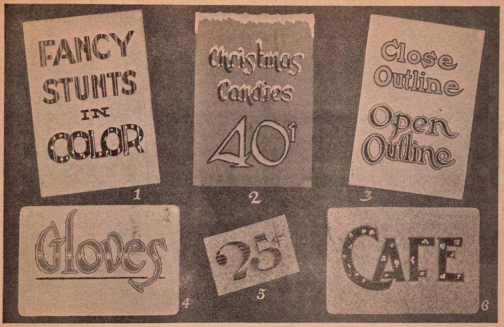
If this work is being done in a class under an instructor, it is suggested that examples be prepared exactly as described on this page, and illustrated on the following page. This will enable the students to gain an exact idea of the work to be done. If the student is practicing alone, it is suggested that cards duplicating, or at least similar to those described, be procured, and the various combinations followed out.
Card No. 1, size 9×13. Mottled mat board with a slight tinge of very light green. First three lines of lettering were done in bright red, and then the words “Fancy Stunts” were striped with light yellow. The word “color” was lettered in dark brown and embellished with light yellow.
Card No. 2, size 9×13. Light blue mottled mat board. Lettering was done in blue—the first lines in dark blue, and the numerals “40” in light blue, outlined with dark blue. The snow effect was accomplished by coating the top of the card and the letters very heavily with thick, white showcard color. Before this color dried, fine “imitation snow”—ground mica—was distributed. The card was then left to dry, after which the surplus ground mica was brushed off into a receptacle, to be used again.
Card No. 3, size 9×13. Pink mottled mat board. Lettering shows two styles of outlining. The first two lines were light purple outlined closely with black—the last two lines were dark purple with rugged light green outline. Note carefully the methods of outlining.
Card No. 4, size 18×8. Linen finish, cream tinted mat board. Lettering was done with No. 10 brush, using orange ink. The outlines and underscoring were done in purple, and the decorative dots over the face of the letters are white put on with small brush.
Card No. 5, size 6½×4½ inches. Light tan mottled mat board. Price was lettered with brush, using dark blue color, shading was done with light blue. The embellishing across the face of the figures was done with white.
Card No. 6, size 12×18 inches. Mottled tan mat board, round cornered. Body of lettering done in dark, reddish brown, then dotted with gold. The letters were outlined with bright red.
DECORATIVE SUGGESTIONS
Plates used by permission of Ely & Walker Dry Goods Co., St. Louis.
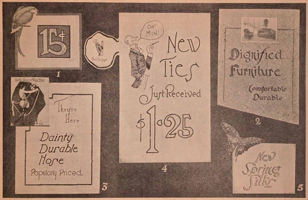
Card No. 1. Size 8¼×7 inches. This was a sample from a wholesale paper house. Body color was a very light green. The border and center panel were made with olive ink. The figures were light yellow and outlined in bright red. The picture of a parrot was cut from a magazine and pasted in the corner of the card as shown.
Card No. 2. Size 10½×14 inches. Dark cream mottled mat board. Lettering was done in a dark gray with No. 10 brush. The initial letters “D” and “F” were shaded with black. The picture which represents a photograph was a neatly printed half-tone, cut from a trade paper. The border of the card was gray.
Card No. 3. Size 10½×13 inches. Plain white cardboard with a picture pasted on the upper left-hand corner cut from a manufacturer’s showcard. The lettering on this card was done in black with the round speedball pen. The border is dark green to match the picture.
Card No. 4. Size 11½×18½ inches. Plain white cardboard. Lettering was done with large round speedball pen. The picture shows the use of the pantograph and the sketch was enlarged from the original at the left. This was enlarged four times as shown on the card itself. After the sketch was traced with a pencil, the drawing was filled in with drawing pen.
Card No. 5. Size 8×6 inches. Plain white cardboard lettered with No. 10 brush, using bright green ink, then shading with black.
The butterfly was a cut-out from a trade paper and pasted to the card-board.
In shading the letters on a showcard, or on any piece of sign work, the student should keep in mind the theory of shading which is as follows:
Imagine, if possible, that the letters to be shaded are about one inch in height from the paper and that a light is being held above and to the right of the letters at an angle of about 45 degrees. If this experiment is carried out in actual practice it will be found that the shadows fall to the left and below the letters. This is the rule for proper shading. The effect can be reversed by imagining the light coming from above and to the left. This would necessitate the shading on the right side of the letter and at the bottom.
Students should study the large cloth signs made by professional sign men, for splendid examples of shading.
PRACTICAL EXAMPLES
Plates used by permission of Ely & Walker Dry Goods Co., St. Louis.
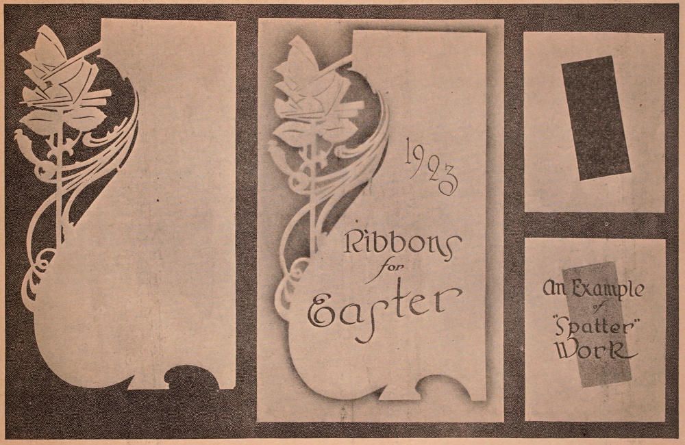
The first figure, that is the figure to the left on the adjoining page, shows the stencil, or pattern, as it is cut from regular stencil stock for use in air brush work or other decorative methods.
The card in the center shows the design after being copied on the showcard. The stencil itself was placed on white showcard, size 14×22, and the air brush color was blown about the margin of the stencil, with the result as shown. The lettering on this design was done with a large size model “C” Speed Ball pen.
The two cards shown to the right are illustrations of how to proceed in doing “spatter” work. The card at the top shows the panel cut out, and this was placed over the card shown just below. The spatter was done with light green color, and the method employed was as follows:
A brush similar to that used in cleaning typewriters was used with regular air brush ink, and this brush was moved backward and forward across the blunt edge of a knife blade. The face of this panel was then lettered as shown. This lettering was done with a large size model “C” pen.
Students who desire to further familiarize themselves with air brush work, should write to the various manufacturers of air brushes, and get literature on this interesting subject. Stencils may also be procured from showcard supply firms or from the manufacturers themselves. Patterns from stencils may also be copied from wall paper designs, pictures, etc., and then cut out with a very sharp knife.
“Air brush” is a name for a finely made tool which has a very delicate spray, operated by means of air pressure.
It is necessary, of course, to attach the air brush to some sort of tank containing air, and for those who use the air brush a great deal, nothing is more convenient than the carbonic air tank furnished by any carbonic gas company.
It is necessary to attach an air regulator to such an air tank. Bear in mind that an air regulator is a combined regulator and pressure gauge.
In addition to the air brush, it is necessary to have extra color cups and about eight feet of rubber hose to attach to the tank.
Ordinary spatter work may be done in a great many ways, in addition to the method mentioned here.
Many showcard men find that an ordinary fine spray atomizer will do very good work, and some even attach an atomizer to a home made air pressure tank, which is fed from a hand or foot pump.
Any method that will add novelty to the appearance of a showcard is very good, especially at the important seasons of the year.
In doing air brush work however, or spatter work, it is very necessary to first procure the regular air brush colors. Ordinary homemade mixtures will drip and ruin your work. The regular air brush colors have in their composition a dryer which causes the color to dry immediately, and also a binder which prevents the color from being rubbed off. Air brush colors are very reasonably priced, and can be secured in a great range of shades and colors.
If the student has difficulty in procuring these materials, he should write to the Educational Department of the Associated Advertising Clubs as suggested in previous lessons.
SPECIMENS—FOR LESSON 8
Plates used by permission of Ely & Walker Dry Goods Co., St. Louis.
This lesson has been designed as a direct follow-up of Lesson 8.
There is a variety of simple and practical suggestions on the following page—giving the student much actual practice.
If work is being done by classes, the instructor should have similar designs prepared and permit the students to copy from them.
It would be much more practical if such designs could be shown to the students before the class closes on Lesson 8.
These designs are all on white cardboard so that very little extra stock is necessary.
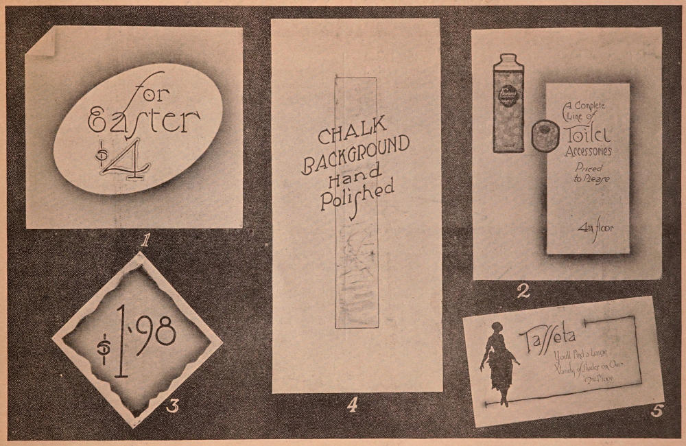
Card No. 1. Size 12×11. Plain white card, air-brushed in black around the oval cut-out. The “turned-down” corner effect was obtained by clipping off the corner and airbrushing a section to represent the portion that would be folded over. The lettering was done with No. 3 round Speed Ball pen, and the figure “4” was outlined in purple.
Card No. 2. Size 11×14 (quarter sheet). Airbrushing was done over a panel with purple ink. The pictures were then pasted on and the lettering done with small size broad point lettering pen.
Card No. 3. Size 7×7. Air-brushed panel background was obtained by “spattering” the color through a “jagged” edged cut-out. Lettering was done with large size round Speed Ball pen.
Card No. 4. Size 9½×20. Plain white cardboard. Faintly decorated panel was made by rubbing in colored chalk dust and outlining this with small pen. Lettering was done with No. 4 round Speed Ball pen.
Card No. 5. Size 11×16. Plain white cardboard. Silhouette was made by transferring the outline of a picture by means of carbon paper. This outline was then filled in with black ink. The border and shading were done in dark red. The lettering was done with small broad lettering pens: a No. 4 Model “C” Speed Ball and a No. 5 Model “C” pen.
SUGGESTIONS FOR PRACTICE
Plates used by permission of Ely & Walker Dry Goods Co., St. Louis.
If the work has been conducted by classes, this lesson will serve as a general review, and students should be asked to duplicate the examples shown on the next page.
The general review work should also include work in the simple alphabets with each student making a card with the round speed ball pen, one card with the broad pen, and one simple brush card.
The examples shown on following page should be shown to the class before the close of the previous class session, in order that the proper preparation may be made.
These cards are not difficult, but have been made up with the idea of giving the student an idea of variety—and individuality.
If an air brush is not available, an atomizer, or a simple “spatter” process will serve just as well.
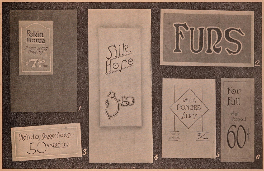
Card No. 1. Size 9¾×14½ inches. The lettered panel was 5×7½ inches. The large part of the card was made by covering a piece of wall board with purple plush and mounting the showcard on it as shown. The showcard itself was of pebble finish, cream colored mat board, lettered in black with the price in white. The border as well as the underscore is also white.
Card No. 2. Size 14×8 inches. The background was light gray; with the mounting in light blue mottled mat board. The lettering was done with the brush, using dark blue ink. The outline was in white.
Card No. 3. Size 10×15 inches. Stock used was linen finish, cream colored mat board; lettering was done in black ink with a wide pointed pen. The border was finished with the air brush, and then striped with white.
Card No. 4. Size 9½×22 inches. Panel was air-brushed in purple; lettering was done with large size round Speed Ball pen; first two lines were underscored in light green. Price was outlined in light green ink.
Card No. 5. Size 8×11¼ inches. Lettering was done with a round Speed Ball pen, and the panel effect with the perpendicular lines was done with the pen, using orange color ink.
Card No. 6. Size 5×12 inches. Light tan cardboard; lettering done in reddish brown ink, using wide pointed lettering pen for the large letters, and the price was done with a No. 10 brush. The border was bright red, and the small lettering was done in bright red.
SUGGESTIONS FOR LESSON 10
Plates used by permission of Ely & Walker Dry Goods Co., St. Louis.
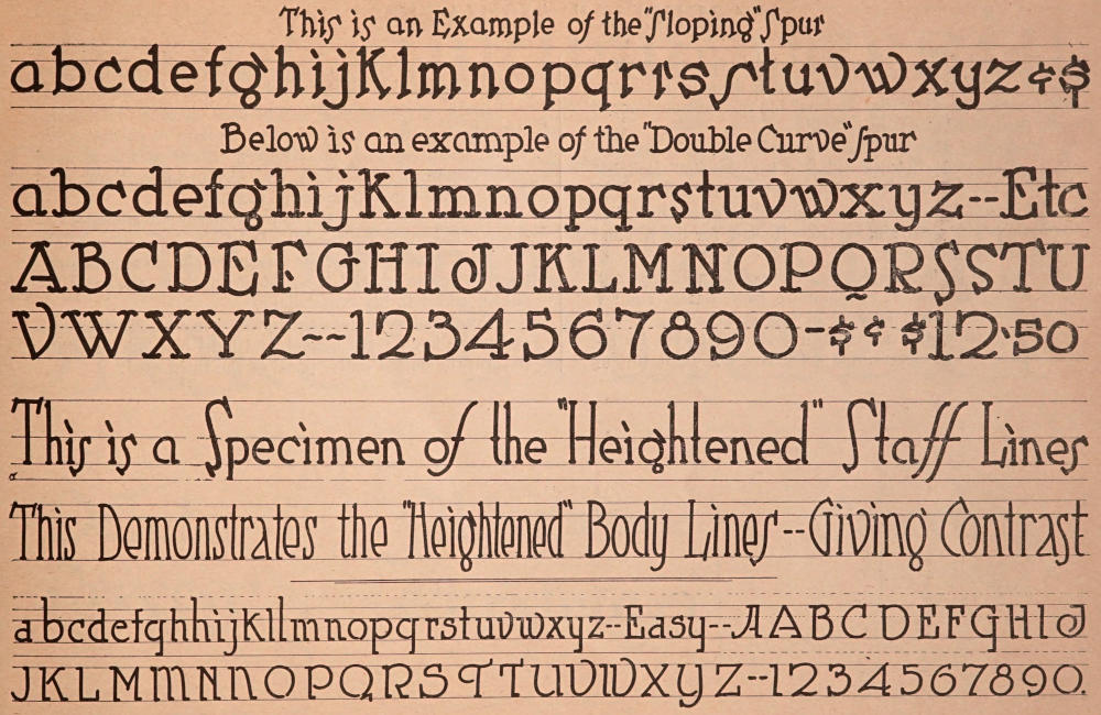
The chart on the following page shows a number of variations which really make separate and distinct alphabets based on the Speed Ball pen alphabet practiced in Lesson 2. From these variations, if studied closely, it will be noticed that the Lesson No. 2 alphabet is used as the basis, and by simply changing the spurs, it is possible to make four or five alphabets from the one model.
The chart as shown on the opposite page is self explanatory. It is only necessary to state that the student should study the changes thoroughly, and when well mastered, they will add much to the attractiveness and individuality of showcards.
By varying the height of the body lines, known also as the staff lines, it is possible to change the entire appearance of this simple alphabet.
The last alphabet shown is much the same as that in Lesson No. 2 with the exception that the spurs are square and face generally in one direction.
It will also be noticed that many of the strokes are left open, at least there is a bit of white space showing between the staffs and the next stroke. This adds a touch of individuality to the alphabet, which is patterned after a popular type face.
In practicing this alphabet, simply rule off the practice paper as shown in previous lessons and follow the chart as closely as possible.
CHART OF VARIATIONS
Plates used by permission of Ely & Walker Dry Goods Co., St. Louis.
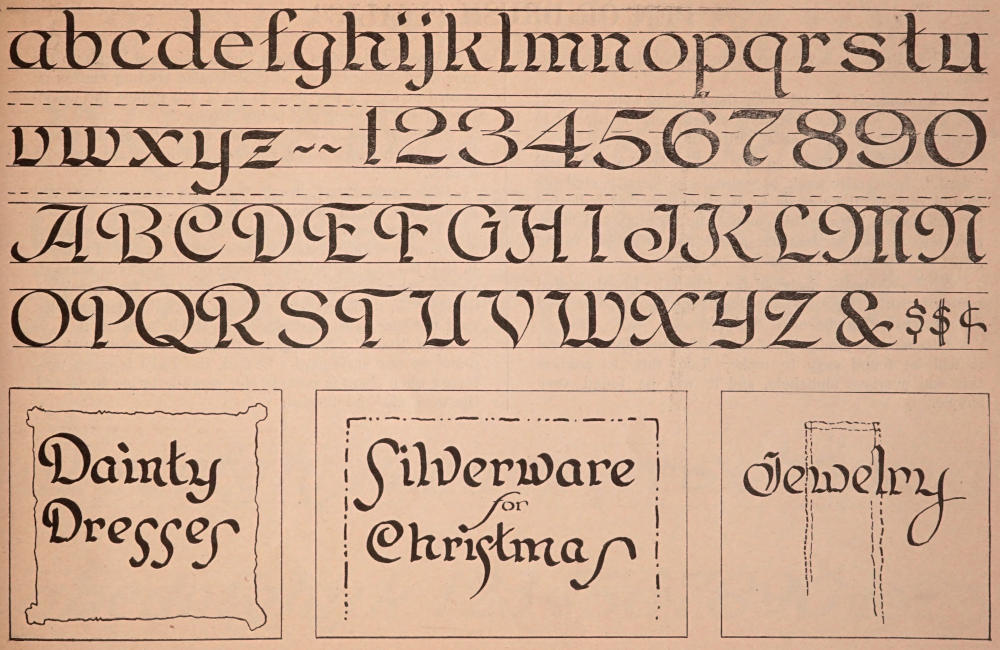
This alphabet is a Variation of the Roman and Old English combined. There is always a demand for something neat, and attractive, and not too difficult or “fancy” to be easily made and easily read.
The same alphabet used week after week becomes monotonous, and students will find the “special” alphabet shown on the following page a very interesting one.
The capitals are quite easy, and follow somewhat after the style of the plain, single stroke Roman, for the pen and brush, shown previously.
Cards to be used in jewelry stores, for millinery, and other high class lines of merchandise, look “classy” and are very attractive when lettered in this style.
When using this alphabet it adds greatly to its attractiveness to procure tinted cardboard. A faint tint of purple, blue, brown, etc., greatly enriches the cards. Cream tinted cardboard is also admirably adapted to this purpose.
Black cardboard may also be used, or other solid color. By thinning the regular showcard colors somewhat with water, beautiful work can be done. Black cardboard with white lettering is decidedly appropriate in jewelers’ windows but the cards must not be too large.
At Christmas time this is a very desirable alphabet because it has many traits of the Old English.
With a little practice the fundamentals will soon become fixed in the mind, and the student will have one more alphabet added to his “vocabulary.”
Practice the layouts as shown, using black cardboard and white ink for the second, and light blue ink on white to form the dotted center panel of the third card.
FOR BRUSH OR PEN
Plates used by permission of Ely & Walker Dry Goods Co., St. Louis.
The “Italic” is a very necessary alphabet in card writing.
The name is derived from the slanting appearance of the letters. In using this style of lettering be careful to have the “slopes” or “slants” uniform.
The angle as shown on the chart is the preferred “slant.” In practice work, to maintain uniformity, students should rule off their cards or practice sheets as indicated by the broken lines. This compels uniformity, and many professional card writers use a specially “slanted” ruling guide or “T” square for making such lines.
This alphabet is designed for either the broad pointed pen or brush. The round speedball pens may also be used for a “slanting” alphabet, if desired.
Compare the similarity of this with other alphabets and it will be found easy to make. Take time to analyze this and previous alphabets, and it will be found very simple.
Words lettered in “Italic” on a showcard break up the monotony. When there is considerable reading matter on a card or sign, a few lines in Italic will relieve the denseness of the lettering and invite reading.
Italic is also much used for catch lines—the short lines—which often occur between the important lines on a card.
The words “the”, “our”, “on” and many others are usually written in Italic.
The last line of lettering on the adjoining reproduction shows some slight variations preferred by showcard writers, in that the spur at the top of some of the staffs is sharper, and on other letters the bottom spur of the first stroke is omitted. In working under pressure many showcard writers omit the spur in all first strokes on the h, k, m and n.
The “Italic” numerals are simple—and much used for prices on any style card. In fact, the Italic is much preferred when there is considerable small lettering to do and the work must be hurried.
“ITALIC” CHART
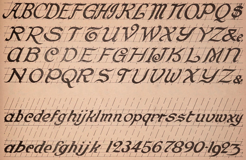
Plates used by permission of Ely & Walker Dry Goods Co., St. Louis.
While the “Old English” stands out in an unusual way for beauty and dignity it must at all times be used with the utmost discrimination. It does not lend itself ordinarily to showcard or poster work and finds its best purposes in connection with Christmas showcards or monogram effects. Jewelry, silverware and gift suggestions of the valuable variety express themselves to the highest advantage in the “Old English” alphabet.
A point to be remembered in using this alphabet, however, is not to combine capitals in one word. Capitals can only be used in connection with the lower case letters. Some of the other alphabets, more specifically the “Egyptian,” work out very effectively in “solid caps.” However, this effect can never obtain in the case of the “Old English.”
The alphabet as shown on the plate is self-explanatory as to combination of strokes. The letters may be made with the brush held at an angle square with the stroke, emphasizing the fine lines, or they may be made with the broad point pen, depending on the size desired.
This alphabet is the most time-taking of any to make and as it adapts itself to only limited purposes, should be used very rarely.
“OLD ENGLISH” CHART
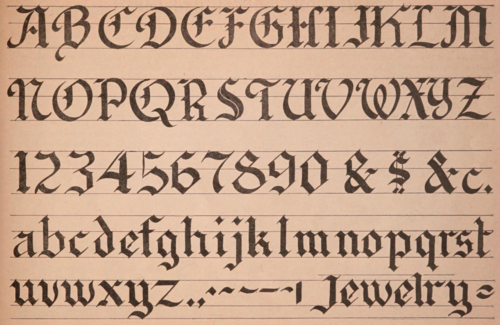
Plates used by permission of Ely & Walker Dry Goods Co., St. Louis.
Card No. 1. Size 8½×17½ inches. Light tan mottled mat board lettered in dark brown ink. This card demonstrates an important point in showcard writing, that—if the price is to be displayed in large figures, the general outline of the space occupied by the numerals should conform to the proportions of the card. Thus a narrow card demands a condensed price.
Card No. 2. Size 20×12 inches. Cream tinted linen finish mat board. Initial capitals in the first line were in bright red, the other lettering in brown, while the price figures were bright red outlined with brown. This style card is reproduced for the purpose of showing that an extended card such as this, which is called the “landscape layout,” should have an extended price that will be in keeping with the general proportions of the card.
Card No. 3. Size 6×12 inches. Light green mottled mat board with lettering in light blue outlined with dark blue and then decorated with dots of white and black. This shows a very pretty card for single price, and in this size also the price figures should conform to the general outline of the card.
Cards Nos. 4 and 5 are what is known as “strip” signs. That is, they are lettered on narrow strips. The originals were about 4½ inches wide. Card No. 4 was lettered on light maroon cardboard with black ink. Card No. 5 was white with black lettering.
If the student enters into practical work and has occasion to make many narrow strips on paper, such paper can be procured in varying widths and in rolls from any firm that carries supplies for showcard writers.
PRACTICAL CARDS
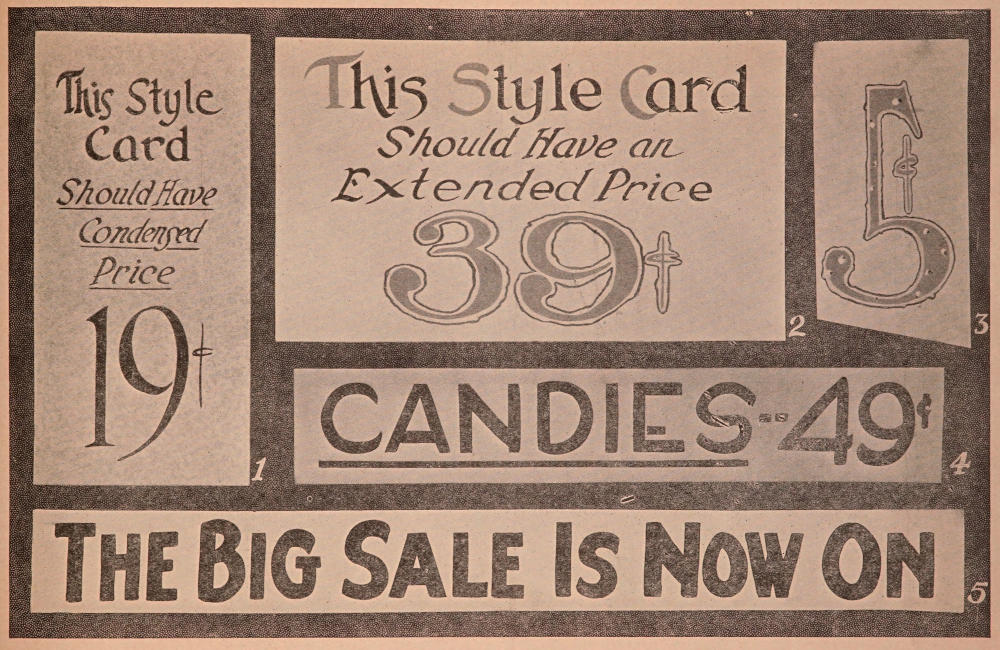
Plates used by permission of Ely & Walker Dry Goods Co., St. Louis.
Card No. 1. Size 16×22 inches. Gold mat board in fancy “cut-out” pattern. Large lettering done in white color with air-brushed shading in light red. Smaller lettering done in black ink.
Card No. 2. Size 16×22 inches. This card was made of tan mottled mat board with air-brushed panel as shown in reddish brown. Large lettering is in white—the small lettering in black. Such cut-out panel effects have the appearance of two sheets of mat board being used.
CARDS FOR SUMMER
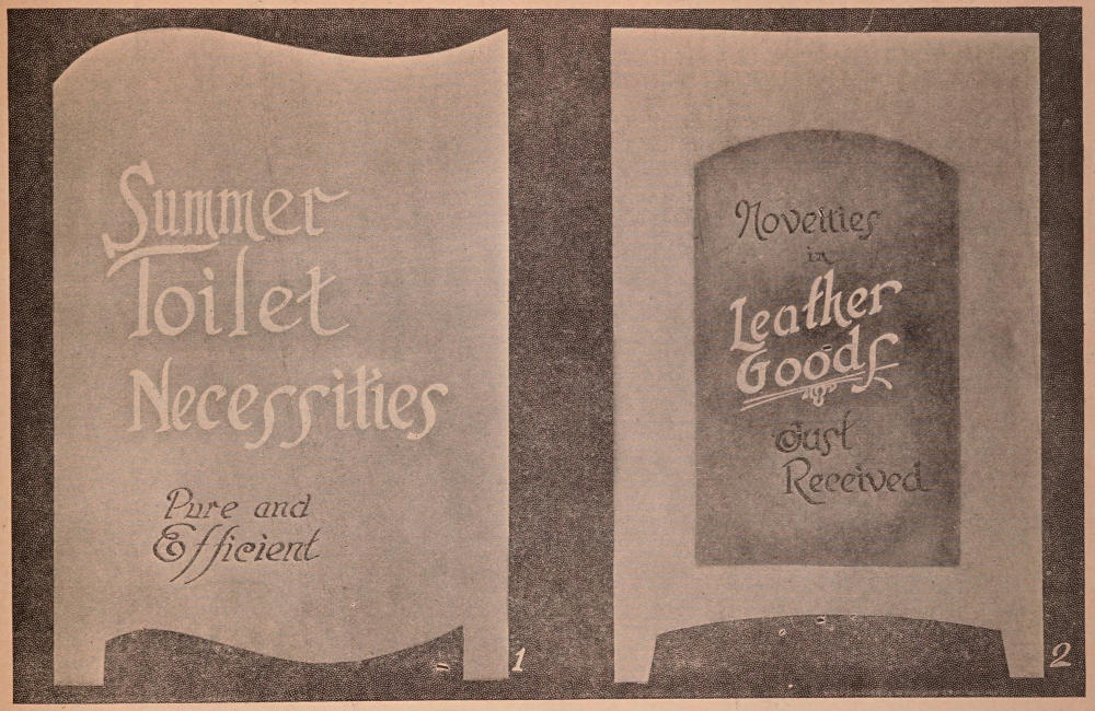
Plates used by permission of Ely & Walker Dry Goods Co., St. Louis.
Card No. 1. Size 16×22 inches. Cardboard is imitation Circassian Walnut lettered in plain white. In lettering on cardboard of this character the student should bear in mind that such board is of necessity an oil finish and that paint with considerable dryer, or printer’s ink mixed with gasoline are best for lettering. Water colors are very unsatisfactory on surfaces of this kind.
This board is a fancy cut-out and may also be procured in the mahogany finish.
Card No. 2. Size 16×22 inches. Plain white cardboard with wall paper mat pasted onto the white board. Space occupied by the lettering was first air-brushed in light green which shows very faintly in the reproduction and this was then lettered with white showcard color, using No. 12 brush.
SUGGESTIONS FOR FURNITURE DEALERS
Plates used by permission of Ely & Walker Dry Goods Co., St. Louis.
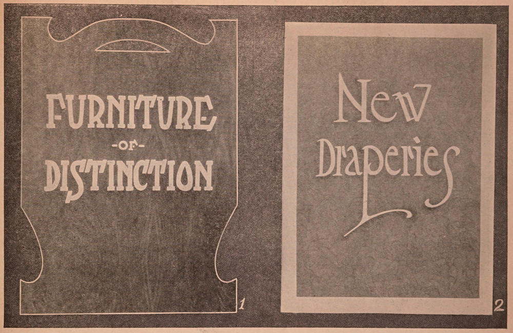
Card No. 1. Size 16×22 inches. This showcard was made of maroon colored railroad bristol. The large lettering, in the “Egyptian” style, was done with yellow color. The clover effect on each of the first letters in the three words was done by grouping three dots in light red color. The smaller lettering at the bottom of the card was done in white color as was also the border, as indicated. This card is attractive in style, featuring the side panel effect with broken border.
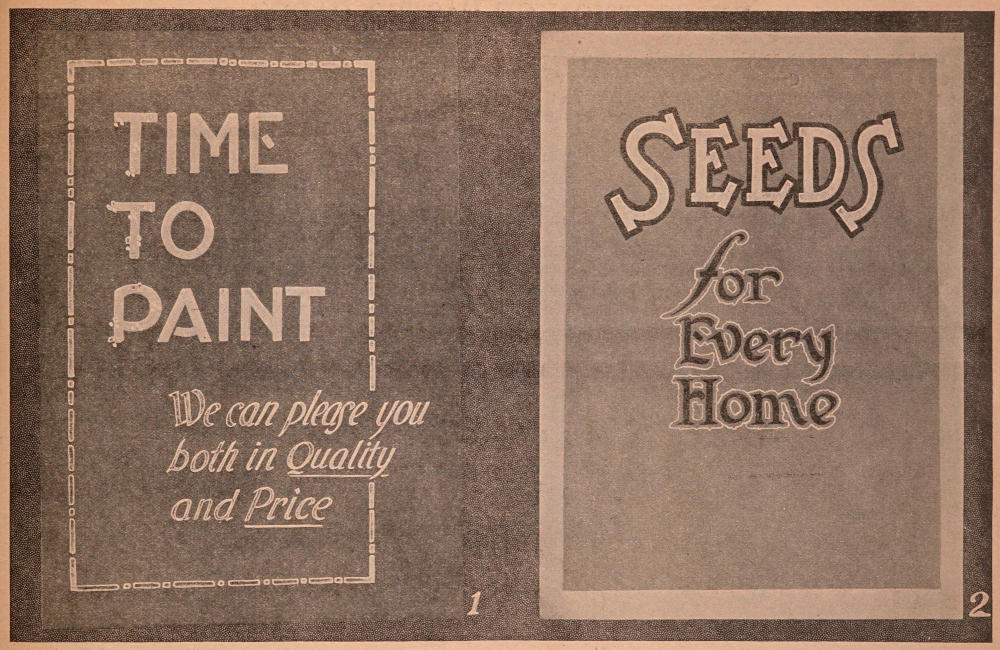
Card No. 2. Size 16×22 inches. Plain white cardboard mounted with a card of pale green. The word “Seeds” is lettered in deep yellow, closely outlined in dark green. The smaller lettering is done in the same shade of dark green and outlined “raggedly” in bright yellow. The color combinations are very effective, especially in connection with this particular kind of “merchandise.”
CARDS FOR EARLY SPRING
Plates used by permission of Ely & Walker Dry Goods Co., St. Louis.
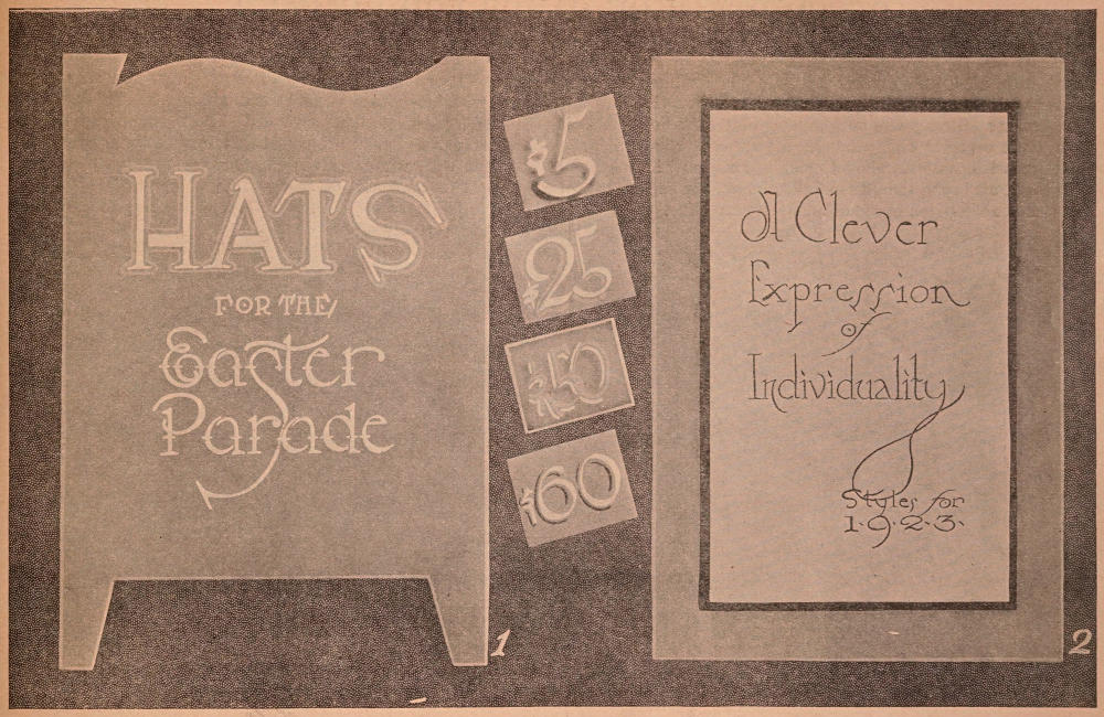
Card No. 1. Size 16×22 inches. Fancy cut-out, heavy purple mat cardboard. Card was beveled and makes a very pretty design for Easter. The lettering was done with the No. 12 brush, using white ink. The word “Hats” was outlined with lavender. The words “Easter Parade” were cross-striped, as shown, with gold ink although this appears as almost white in the reproduction.
The price cards shown in the reproduction were lettered on purple cardboard. The first price ticket was white, shaded in light green with the air brush. The next card was lettered in white and shaded with lavender. The third card was lettered in lavender and outlined with white. The border of the card was air-brushed with green ink and then striped with white. The last card shown was lettered with yellow on purple cardboard shaded with light red.
Card No. 2. Size 16×22 inches. The original of this card was very beautiful. The center panel in the reproduction does not give the clear detail of the quality of stock used. The background of the original was heavy purple mat board and the center panel was of grain finished cover stock tinted with purple. The center panel in the original gave the appearance of a piece of white kid stretched over the surface of the mat. The edges of the lettered panel were heavily air-brushed in black ink. The lettering was done with small size model “C” speed ball pen.
Such cards add much to the attractiveness of any window display and students should procure samples of this paper stock from some source and note its beautiful finish.
If work is being done in class—such examples should be exhibited to the students.
EASTER CARDS
Plates used by permission of Ely & Walker Dry Goods Co., St. Louis.
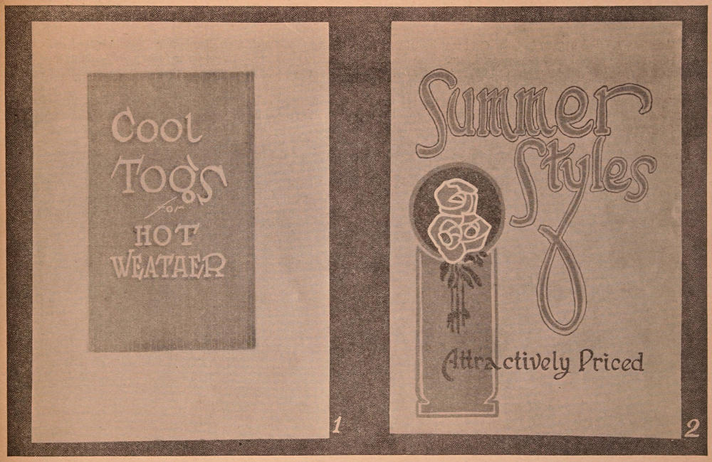
Card No. 1. Size 16×22 inches. Made of white cardboard with air-brushed panel in light blue and panel is striped with faint white lines. You will note that the lines are heavier at the top and bottom, apparently “fading out” toward the center. This produces a very cool, elusive effect, suggesting water. The lettering is done in white color with slight air brush shading in light green. For suggested coolness the colors here used are uniquely effective.
Card No. 2. Size 16×22 inches. Light tan mottled mat board. Large lines of lettering in dark gray—first line outlined with black lines, second with light green. The bottom line of lettering is done in black. The panel in the ornamentation was done in gray—the flowers are of bright red outlined with white against circular background of dark blue. The conventional foliage falling from flowers was done in light green. Card No. 2 would be very effective in a window display of footwear.
CARDS FOR SUMMER
Plates used by permission of Ely & Walker Dry Goods Co., St. Louis.
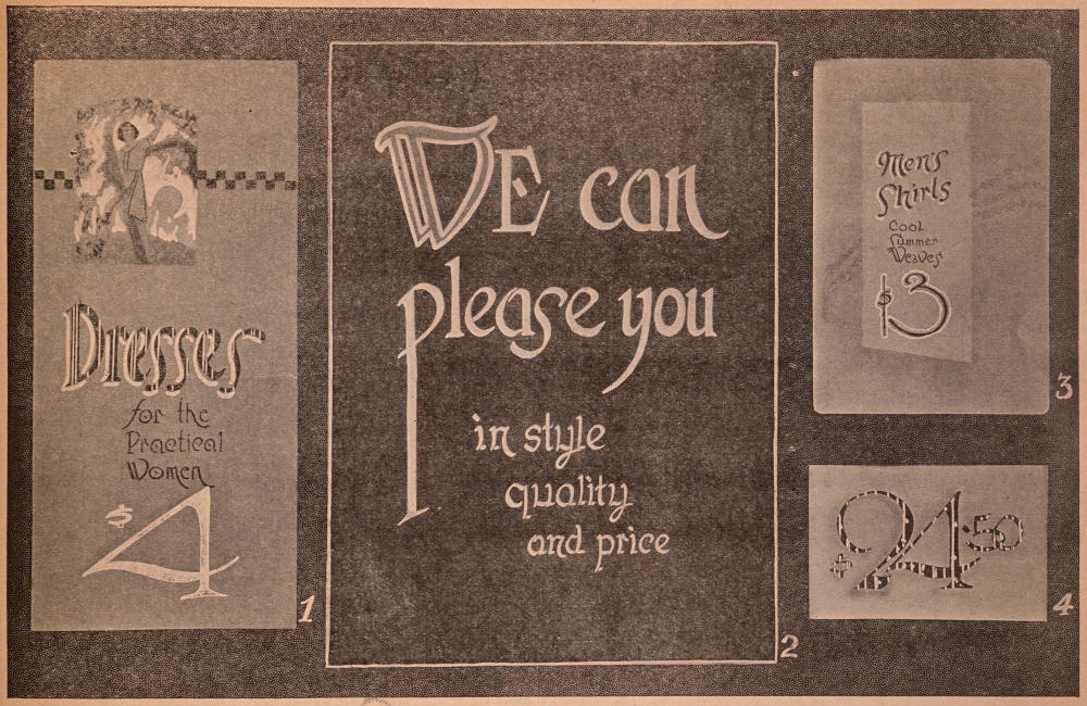
Card No. 1. Size 9½×20 inches. Gold mat board with a cut-out picture pasted near the top as shown. The checker-board border was made with bright red. The word “Dresses” was lettered with No. 12 brush using bright red showcard color. This line of lettering was also shaded and striped with white showcard color. The small lines of lettering were done with No. 4 model “C” speed ball pen, using regular ink for pen work. The numeral “4” was lettered with white and then lightly air-brushed or shaded with dark red.
Card No. 2. Size 16×22 inches. Dark brown cardboard with the letter “W” in light green, outlined with gold. The balance of the first two lines of lettering was done with No. 12 brush using cream showcard color. The last three lines were made with a smaller brush using light red showcard color and mixed with yellow to form a very pale pink.
Card No. 3. Size 8½×13 inches. Plain white cardboard, round-cornered, with border outside of the panel air-brushed in light yellow. The flowers which show faintly in the reproduction were violets made with a small brush, using purple ink. The vines were done in light green. The lettering was done with model “C” speed ball pens, using gray ink for shading the words, “Men’s Shirts.” The numeral “3” was outlined in white.
Card No. 4. Size 9×5½ inches. Plain white cardboard lettered with No. 12 brush and black showcard color. The border and the figures were then airbrushed in purple ink and the face of the figures striped with white.
ATTRACTIVE SUMMER DESIGNS
Plates used by permission of Ely & Walker Dry Goods Co., St. Louis.
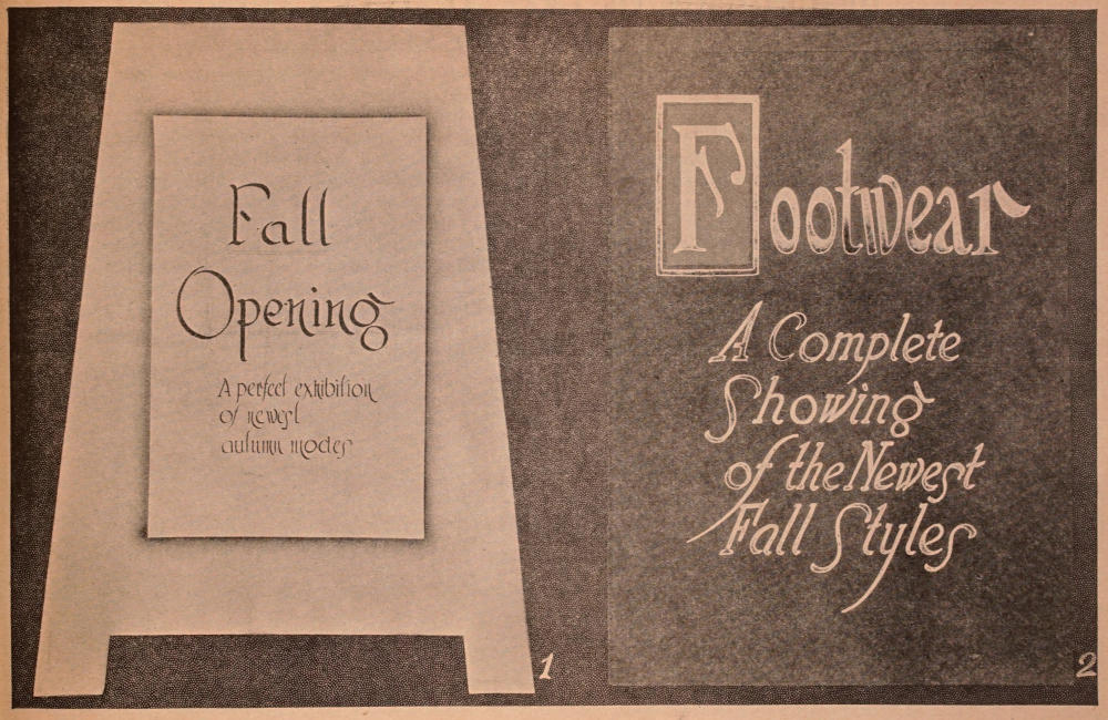
Card No. 1. Size 16×22 inches. Greenish gray mottled mat board, cut out in attractive easel effect. Panel is of white cardboard with air-brushed shading in yellow. The words “Fall Opening” are lettered in dark red. The smaller lettering was done in black ink with the model “C” speed ball pen.
Card No. 2. Size 16×22 inches. Dark green mottled mat board. Initial letter in “Footwear” was done in white color against a bright red background, with border in gold. Balance of letters in word “Footwear” were done in white.
The four lines of Italic lettering were done in light cream color. Note the even slant in the “Italic.”
CARDS FOR FALL
Plates used by permission of Ely & Walker Dry Goods Co., St. Louis.
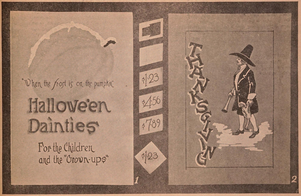
Card No. 1. Size 16×22 inches. The pumpkin design was air-brushed, by first cutting out a stencil the size necessary and then using orange and yellow air brush ink with an outline of light green.
The small line of lettering was done with a No. 3 model “C” Speed Ball pen. The words “Hallowe’en Dainties” were lettered in “Egyptian” with a No. 12 brush, and the color was dark red.
These two lines were air-brush shaded in light green. The last two lines of lettering were done with a small brush in black ink.
The “frosting” effect was obtained by using heavy white showcard ink as indicated, and then ground mica was sprinkled on the ink. This makes a very attractive showcard for Hallowe’en season.
Card No. 2. Size 16×22 inches. Thanksgiving design. The drawing of the Pilgrim was made offhand, first being sketched in with pencil, and then black ink was used, touched up with white. The showcard stock was of reddish orange. The word “Thanksgiving” was drawn with the brush in black and shaded with white.
The small price cards shown in the center were plain white cardboard. The first sign shows the method of making a “mask” or “cut-out” for the lining of a large number of cards, when it is necessary to have them equally spaced.
The next card shows a suggested penciled-in sketch, and the remainder, the actual pen lettering. These cards were then daintily air brushed on the edges. The square card shown was a small card three inches square, also lettered with pen.
CARDS FOR LATE AUTUMN
Plates used by permission of Ely & Walker Dry Goods Co., St. Louis.
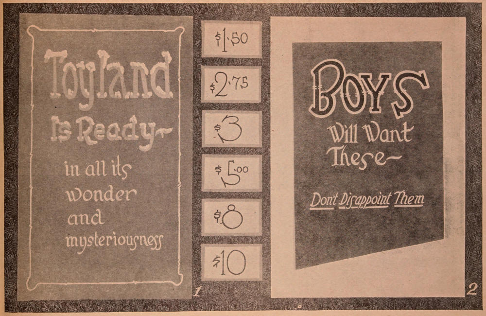
Card No. 1. Size 14×22 inches. Deep blue cardboard stock with border line in white. The words “Toyland is Ready” were done in bright green color. White color was then applied freely and with careless effect at the top of the white letters and also in the bottom curves and spurs. While the white color was quite wet ground glass or “mica” was sprinkled into it, thus producing the effect of snow. The balance of the lettering was done with the brush in bright yellow color.
Price cards shown in the center of the reproduction were made of white cardboard. Numerals were written in with black ink with model “B” speed ball pen. Each card features a different colored, flat band border of dark blue, tangerine, maroon, orange, mauve and bright yellow, respectively. This border is made by “chiseling” the brush out perfectly flat and laying it full width, or whatever width may be desired, on the edge of the card and dragging it steadily down on each edge of the card. Colored borders on price cards add much to their attractiveness. Try out the combinations suggested.
Card No. 2. Size 14×22 inches. Plain white cardboard mounting with panel of dark green, mottled cover stock. The word “Boys” was lettered in dark green and closely and somewhat unevenly outlined in bright yellow. The balance of the lettering was done in very light green, the last line also underscored in the same color.
CARDS FOR CHRISTMAS
Plates used by permission of Ely & Walker Dry Goods Co., St. Louis.