
An Art-Craft Problem
Booklet Making
An Art-Craft Problem
Henry Turner Bailey
Editor of “The School Arts Book”
The Prang Company
New York Chicago Boston Atlanta Dallas
Copyright, 1912
By Henry Turner Bailey
[Pg 3]
THE MODERN BOOK SHOULD BE THE OUTGROWTH OF ITS OWN TIME, CONSISTENT IN ALL ITS FEATURES.—DE VINNE
The making of a good booklet involves the vital correlation of several school topics and processes, presents many opportunities for sound instruction, gives a wide scope for individuality and furnishes genuine training of hand and eye. From such work the pupils derive more pleasure and more solid satisfaction than from any other school project yet discovered.
Success depends upon forethought. The teacher who thinks the problem through to the end, who sees clearly the steps to be taken in order from first to last, and who makes adequate preparation for the taking of each step with the class, will not be disappointed in the result. One may rise to a higher level in many ways: the ancient “spiral” incline, the notched log, the ladder, stairs, and, in these days, the moving sidewalk, and the elevator, are all good lifts. These all have their correspondences in school work, and all have been efficient. This little book presents ten well-worn, fireproof steps which, if taken without haste, will land the aspirant safely on the floor above the present level of average school work.
First, Decide upon the Kind of Booklet
The choice would be influenced by the grade of school, by the previous experiences and achievements of the children, by the course of study, and by the amount of time to be devoted to the work. In primary grades, possibly a six- or eight-paged pamphlet with paper covers, bound with a single thread, may be all that should be attempted. In [Pg 4]the grammar grades a booklet with covers of paper or cloth over cardboard may be achieved, while in the high school a book properly bound in boards may not be too desperate a venture.
Second, Decide upon the Subject
Here, again, a wide range presents itself. The subject, also, must be determined by local conditions. A classified list may serve to present a general survey of the field.
Personal—Records of adventures, mishaps, strolls, games, fads.
Geographical—Records of journeys, real and imaginary; studies of towns, cities, counties, states and countries, and of world features such as a pond or lake, the ocean, a mountain, etc.
Natural—Studies of individual objects or of a group of objects in the realm of the plants, the birds, the animals, insects, fishes, or among the elements, clouds, minerals, metals, etc.
Historical—Studies of myths and legends, the records of events and achievements, of famous sites, buildings, etc., of historic significance.
Industrial—Studies of occupations, trades, manufactured materials and processes, commerce, inventions, etc.
Biographical—Studies of the lives of famous people, inventors, leaders of thought, statesmen, poets, artists, sculptors, architects, authors, musicians, etc.
Appreciative—Studies of masterpieces in the arts, pictures, poems and other forms of literature, statues and other forms of sculpture, architecture and handicraft, pieces of music, etc.
Technical—Collections of papers having to do with such school topics as writing, spelling, arithmetic, algebra, geometry, mechanical drawing, grammar, and the like.
The subject selected for the first booklet should be a popular one with the class, and one for which illustrative material is available or may be easily made.
[Pg 5]
Third, Determine the Contents
To make this discussion as helpful as possible I have decided to make it concrete, and therefore have selected a project—a grammar-grade booklet bound in paper covers—and a subject—the poet Longfellow.
Let us suppose I am a seventh-grade teacher. My pupils have heard about Longfellow from their first-grade days; they know by heart some of his poems. Moreover, he is one of my own favorite poets. With the first money I ever earned working for strangers I purchased a copy of Longfellow’s poems. I have that book in my desk this moment. I visited his home in Cambridge once. I know a man who knew him. I can make Longfellow real to the children, make them enthusiastic about him and his poetry.
I therefore present the matter to my class.
With a beautiful booklet or two that I have borrowed from some other teacher, or with a copy of the “School Arts Book,” describing and illustrating a booklet,[A] I present the project and call for suggestions as to subject. All subjects offered are considered and discussed, but being in the saddle, so to speak, I guide my class, without their knowing it, toward the subject I have decided upon as best for them, and we all vote with high anticipation to make Longfellow booklets.[B]
We next discuss how large a booklet we should attempt. Better do a little thing well than a big thing ill. We jot down on the blackboard a few possibilities. We could make or find the following, at least:
A portrait of Longfellow.
A picture of his home.
A map of the region where he lived.
[Pg 6]An account of his life.
A list of his most popular poems.
Quotations about him and his work.
A copy of a favorite poem or verse.
A brief statement as to why the quotation is a favorite.
An illustration for this favorite quotation.
A cover of appropriate color.
An appropriate cover design.
We may not include all these items in every booklet, but we are now ready to take the next step.
Fourth, Gather the Material
A large flat open box is now placed on my desk or in some other convenient place in the schoolroom, in which the children may deposit any appropriate material they find. They begin with the pictures. They search everywhere for portraits of Longfellow, pictures of his house, illustrations for his poems, etc., that they can bring to school for use in the booklets. Each contribution to the box is marked with the initials of the pupil who brings it. We gather all the suggestive material we can—examples of well-arranged pages, ornamental initials, head bands, tail pieces, covers, cover ornaments, and the like, and secure through the superintendent, if possible (if not, by some other means),[C] such penny pictures as we foresee to be necessary.
Ultimately all this material will be distributed to the children and used in one way or another. I lead the children in the quest for information. I teach them how to “read up” and to make notes and quotations. I show them almost every day what I am gathering, for of course I am going to make a booklet myself. A teacher is a shepherd, not a cowboy! He doesn’t round up to drive; he calls [Pg 7]together to lead. Here is what I have gathered for my booklet on Longfellow:
Several different portraits of Longfellow.
The Longfellow statue at Portland, Maine.
The house where he was born, Portland.
The Longfellow mansion at Portland.
Longfellow’s home at Cambridge.
Longfellow’s armchair.
Longfellow’s daughters.
Evangeline.
The Wayside Inn, Sudbury.
A half-dozen pictures illustrating “Hiawatha.”
Two illustrating “The Building of the Ship.”
Five illustrating “Evangeline.”
“The Bridge at Midnight.”
“The Bell of Atri.”
Three pictures that might be used in illustrating “The Birds of Killingworth.”
A picture of the tower which contains the belfry of Bruges.
A picture of a Viking ship and the head of an old Viking.
A drawing of a prow of a Viking ship.
A photograph of the portal of the old church of Trondhjem.
A dozen examples of Scandinavian ornament.
Several symbols appropriate to the subject of poetry, such as Pegasus the winged horse, the flying torch, the scroll of inspiration, a wreath of victory for the successful poet, a bouquet of flowers symbolical of a volume of fine poems, etc.
Fifth, Plan the Booklet
The orderly format of modern books and pamphlets is displayed in the following table:
[Pg 8]
THE ORDERLY FORMAT OF BOOKS AND PAMPHLETS
| The Essential Features |
Leaves | Order of Elements in a Sumptuous Edition of a Book An Edition-de-Luxe |
Paging | For a Bound Volume | For a Thick Pamphlet | For a Thin Pamphlet | For a Leaflet | |
|---|---|---|---|---|---|---|---|---|
| Front Cover | ⎰Outside: Title | A | A[10] | A[10] | ||||
| ⎱Inside: Pasted end paper[1] | B | B[11] | B[11] | |||||
| Front Matter | End paper | ⎰decorated side | ||||||
| ⎱blank | ||||||||
| 1st | Fly leaf | ⎰blank | C | C | ||||
| ⎱blank | D | D | ||||||
| 2d | ⎰Half-title[2] | i[8] | E | |||||
| ⎱Blank, or with notice of other work by same author | ii | F | ||||||
| 3d | ⎰Blank | G | E | |||||
| ⎱Frontispiece[3] | H | F | ||||||
| 4th | ⎰Title-page[4] | iii | I | G | C | A[12] | ||
| ⎱Copyright notice, printer’s imprint, etc. | iv | J | H | D | B[13] | |||
| 5th | ⎰Dedication, or quotation[5] | v | K | |||||
| ⎱Blank | vi | L | ||||||
| 6th | ⎰Preface | vii | M | |||||
| ⎱Preface continued, or blank | viii | |||||||
| 7th | ⎰Table of contents | ix | N | I | ||||
| ⎱Contents continued, or blank | x | |||||||
| 8th | ⎰List of illustrations[6] | xi | O | |||||
| ⎱List continued, or blank | xii | |||||||
| 9th | ⎰Introduction | xiii | P | |||||
| ⎱Introduction continued, or blank | xiv | |||||||
| 10th | ⎰Repetition of half-title | xv | Q | |||||
| ⎱Blank | xvi | |||||||
| Main Text | 11th | ⎰Chapter heading. I. Text | 1[9] | R | J | E | C | |
| ⎱Text continued | 2 | |||||||
| 12th etc. | ⎧Text continued through this | 3 | ||||||
| ⎭and succeeding chapters; | 4 | |||||||
| ⎫pages are numbered, in order, | 5 | |||||||
| ⎩throughout to the end of the index | etc. | |||||||
| End Matter | Appendix[7] | S | ||||||
| Notes[7] | T | |||||||
| Glossary[7] | U | |||||||
| Index | V | K | ||||||
| Fly leaf | ⎰blank | W | L | |||||
| ⎱blank | X | M | ||||||
| End paper | ⎰blank | |||||||
| ⎱decorated side[1] | ||||||||
| Back Cover | ⎰Pasted end paper | Y | N[11] | F[11] | ||||
| ⎱Outside | Z | O | G | |||||
NOTES:
[Pg 9]
However simple our booklet is to be, its plan should be orderly. With this table as a guide and with such books as the children may have for reference, we work out on the blackboard the plan for our booklets. We will not be too ambitious at first. Here is our plan:
| Front Cover | ⎰Outside: Cover design | ||
| of colored paper | ⎱Inside: Blank | ||
| Front matter | 1st leaf |
Fly leaf | ⎰blank |
| on white paper | ⎱blank | ||
| 2d leaf | ⎰Blank |
||
| ⎱Frontispiece | |||
| 3d leaf | ⎰Title-page |
||
| ⎱Imprint[D] | |||
| Main Text | 4th leaf | ⎰Chapter heading, I. Text | |
| on white paper | ⎱Text |
||
| 5th leaf, etc. | Text continued with illustrations to include the following chapters: | ||
| I. Life. | |||
| II. Most Popular Poems. | |||
| III. My Favorite Poem. | |||
| End Matter | Appendix |
List of books consulted and sources of illustrations. | |
| on white paper | |||
| Fly leaf | ⎰Blank |
||
| ⎱Blank |
|||
| Back Cover | ⎰Inside: Blank | ||
| of colored paper | ⎱Outside: Cover design | ||
[Pg 10]
The x in this equation is the main text. Inasmuch as all our leaves must be one-half of a folio[E] to bind properly, we must know just how many pages our booklet is to contain, before we begin to forecast its final form. This means that we make a dummy.
Sixth, Make a Dummy
A dummy is a sketch of the book, so to speak, made of cheap paper, but having the exact size and right number of pages.
Before we can make a dummy we must, of course, decide upon the size and shape of the pages. The illustrations will determine this.
The game is now “Follow the leader,” more closely than ever.
I lay out my illustrative material, the pictures I have gathered for my own booklet, on my desk, and decide how I would better use them. Not being limited by conditions imposed by the printer or publisher, or by “the trade,” I will have all my pictures “read” with the text, so that I shall not have to hold the book one way to read the text and another way to look at the pictures. As a rule it is well to have the choicest, the most important, the most significant picture used as the frontispiece. If this happens to be the largest the problem of size and shape of pages is solved—almost. The picture is placed on a sheet of manila paper, and proper widths of margins to set off the picture to best advantage are determined by experiment. In the case of a picture on a page to be seen by itself, the top margin should be narrower than the bottom margin and the side margins slightly wider than the top margin (in the case of a wide picture), or slightly narrower than the top margin (in the case of a narrow picture) and equal to each other. In an opened book the two pages become the unit perceived by the eye. In this case the inner margins are narrower [Pg 12]than the top margin. As the book presents a more harmonious appearance when the pages are uniform, picture pages and text pages are treated alike.[F]
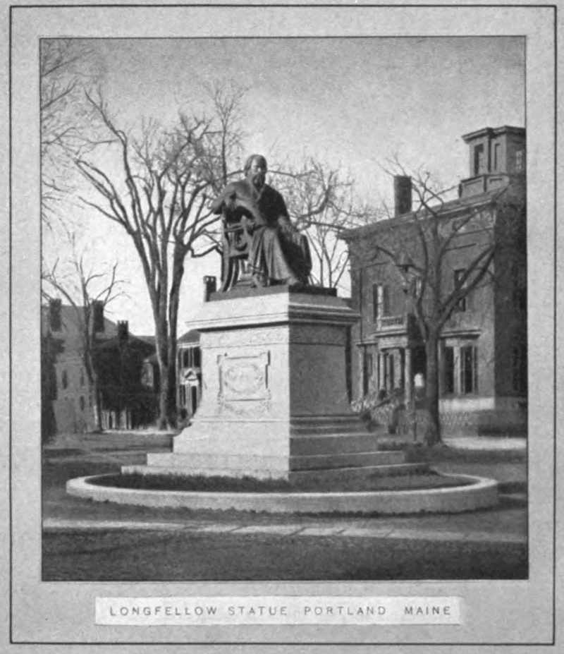
Plate I.
The frontispiece may determine the size and shape of the pages and the widths of the margins throughout the entire booklet.
If the picture to be used as frontispiece is not the largest, the size and shape of pages may be determined by that picture just the same; but it may be necessary to discard the largest picture in favor of the best one. In the case of my own booklet, for example, I decided to use a picture of the Longfellow monument at Portland as my frontispiece, Plate I. This, with proper margins, gave me a “vertical” page, nearly square in shape.[G] I found it necessary to discard the larger pictures I happened to have of his birthplace and home, and to trim severely my picture of the Wayside Inn. The illustrations should seem to place emphasis where it belongs. A picture of Mount Vernon, for instance, filling an entire page and a portrait of Washington cut from a postage stamp would be incongruous. The man should receive the emphasis rather than his house.
The children should now do as the teacher has done. The resultant frontispiece pages will vary, of course, each pupil having his own, thus insuring booklets of various sizes and shapes (unless the pictures selected happen to be uniform in size). From an educational point of view the greater the variety the better.
Having decided the size and shape of my pages, I next estimate the number of pages I can fill with my other illustrations and my probable text, and then proceed to make a dummy of any sort of inexpensive paper I can find. The folios must, of course, be twice the size of the frontispiece page, to fold to that size. I have decided to make six folios, giving me a total of twelve leaves, or twenty-four pages. The cover will make one folio more. But that need not be considered as yet. This dummy may be bound by using a [Pg 13]couple of ordinary pins in the fold. Place the folios one inside another, open the whole, flat, and insert the pins so that the heads and points will be inside when the dummy is folded in pamphlet form. I now number the pages and designate them as follows:
| (First page, outside) | i. | Fly leaf. |
| (Second page, inside) | ii. | Fly leaf. |
| (Third page, recto[H]) | iii. | Blank. |
| (Fourth page, verso) | iv. | Frontispiece. |
| (Fifth page, recto) | v. | Title-page. |
| (Sixth page, verso) | vi. | Personal. |
| (Seventh page, recto) | 1. | Chapter I. Longfellow’s Life. Initial. |
| (Eighth page, verso) | 2. | Text. |
And so continue, leaving the last leaf unnumbered.
Up to this point the booklets of the children will be alike in arrangement. Beyond this point they will vary according to contents.
My own booklet continues as follows:
| Page | 3. | Portrait of Longfellow. |
| 4. | Text. | |
| 5. | Text with two small illustrations, Birthplace and Home. | |
| 6. | Text. | |
| 7. | Chapter II. Popular Poems. Initial. | |
| 8. | Text. | |
| 9. | Chapter III. My Favorite Poem. Initial. | |
| 10. | Text. | |
| 11. | Text with illustration, The Wayside Inn. | |
| 12. | Text. | |
| 13. | Illustration, Ships of the Norsemen. | |
| 14. | Text. | |
| 15. | Text. | |
| 16. | Text with tailpiece. | |
| Fly leaf. |
[Pg 14]
The margins decided upon, with the aid of the frontispiece, should now be transferred to all the pages of the dummy (except the fly leaves). This may be done by pricking through the frontispiece sheet with a pin. The margin lines should be ruled lightly, in pencil, on all the pages, and the position and size of each illustration should be indicated by drawn rectangles. Space should be set apart for the chapter headings.
“The amount of blank space at the head of a chapter should be governed by the amount of matter, shape of the page, the style of leading, and often by the character of an initial letter. In very open text matter (lines far apart) nearly half a page of blank may be given to the chapter heading and head piece; in leaded matter (lines not very far apart) one-third or less is sufficient; when there is no head piece the space is usually less, one-quarter or one-fifth. The space allowed for the first chapter heading of a book should be, when practicable, the same in other similar headings.”[I] In some manuscript books no space is allowed, the chapter heading being emphasized by the ornamental initial and first line.
The chapter heading should be uniform in style with the text, but written larger if the heading is brief. If the text is a somewhat formal hand the heading may be in caps. Script caps and Old English caps should never be used for entire words except under extraordinary conditions.
“When the chapter heading is long and will not readily come into one line, make two lines of it, the first one less than the full measure and the over-run a shorter line in the center below it. To make the first line full, in this case, and to put in the second line one word or syllable only, is not good arrangement. Two short lines, properly spaced, are more pleasing, as well as more legible, than one line crowded at the ends.”[I]
[Pg 15]
Seventh, Write the Text
Chapter I—This chapter, Longfellow’s Life, may be written from an outline worked out by the class and placed on the blackboard as a guide to each individual pupil. The traditional topics may be included:
His parentage.
Place and date of birth.
Boyhood.
Education.
Manhood.
Work.
Honors.
Date and place of death.
Present standing as a poet.
While the outline will be the same for all, the text will vary, or should vary, according to the individuality of the pupils. The teacher should not force even children to occupy a Procrustean bed. The charm in children’s work lies in its freshness, its independence, its lack of deference to traditionalism. On the other hand, the teacher’s business is guidance. The children should be led to recognize good form. Slang should be avoided. A certain precision is necessary in written words, where quality of voice, expression of countenance and gesture cannot assist in making clear the intention of language.[J] To secure good English without destroying originality—but that is another story.
The children should write their essays on scrap paper, keeping in mind the space allotted to the chapter in the dummy. Of course the dummy is not final. A new folio may be added at any time, or a folio may be removed. But the pupil must remember that a folio means four pages. The adaptation of text to space is another good opportunity for self-discipline in English.
[Pg 16]
Chapter II—This will consist of a list of titles, with a suitable introductory paragraph and, perhaps, a final paragraph of comment. The list should be worked out by the children. What poems have they learned? What poems do their parents know? What poems are most frequently quoted, or referred to in conversation, in books, etc.?[K] Why are such poems popular? Is the poet still waxing or waning in popularity? The substance of this chapter will be the same in all the booklets.
Chapter III—Here individuality blossoms! No two of these chapters will be alike. Each pupil is to reveal himself, speak his own mind, in his own way. The teacher must here keep in the background until the pupils have arrived at an honest expression of their own preferences. Then what the teacher has written about her own favorite selection may be read to the school as a suggestion, to give the children some idea of how to proceed in the writing of this third chapter. Here is my third chapter:
Of all the poems of Longfellow I enjoy most that part of the “Tales of a Wayside Inn” known as “The Saga of King Olaf.”
When I was a little boy my mother used to recite to me long passages from “Hiawatha.” I liked that poem best then, but that was before I could read for myself. Later I liked to read about the “Courtship of Miles Standish”—but now I like the Olaf Saga best. Perhaps it is because I was born within sight of the Atlantic, and love
the ocean’s dirges,When the old harper heaves and rocksHis hoary locks,Flowing and flashing in the surges.I have seen “the red light in the sky” and watched the north when the rifted streamers o’er me shook and shifted. I have seen
Eyvind Kallda’s crew,Of warlocks blue,With their caps of darkness hooded.And I have watched the morning when
Athwart the vapors dunThe Easter sunStreamed with one broad track of splendor.[Pg 17]
Perhaps I love it because so many of my ancestors were soldiers or sailors or ship builders in northern Europe or in America. Perhaps it is because of the story itself and the way it ends. Perhaps it is because of the appropriate variety in the rhythms of the different sections, so expressive of the occasion in each case. Perhaps I cannot tell why.
Anyhow, I like the bold defiance in the Challenge of Thor, the swing of rollers at sea in King Olaf’s Return, the creepy repetition in The Wraith of Odin, the hurry and the lingering in Gudrun, the jolly swing in Thangbrand the Priest. I might go on in this way through the entire series, mentioning the clash and rattle in the fight at sea, and the beautiful dignity of the musical voice that speaks to Astrid the Abbess, but I want to mention other reasons why I like the Saga.
I like it because it is full of such vivid pictures. When I read I am right there sailing and fighting and feasting with the king and his men.
I like some of the people I meet, and admire almost all of them. Queen Sigrid is a queen! Old Iron-Beard is splendid. Raud the Strong is an “Old Roman,” game to the end! Thorberg Skafting is a true craftsman. Einar Tamberskelver is a brilliant hero, and Kolbiorn as faithful a friend as ever lived and died.
But I think some parts of these poems are as perfect poetry as I ever read. Is there anywhere in four lines a more beautiful description of moonlight than this?
On King Olaf’s bridal nightShines the moon with tender light,And across the chamber streamsIts tide of dreams.Where are there better pictures in a few musical lines than these?
Short of stature, large of limb,Burly face and russet beard,All the women stared at himWhen in Iceland he appeared.“Look,” they said,With nodding head,“There goes Thangbrand, Olaf’s priest.”When they landed from the fleet,How they roared through Drontheim’s street,Boisterous as the gale!How they laughed and stamped and poundedTill the tavern roof resoundedAnd the host looked on astoundedAs they drank the ale!In the convent of Drontheim,Alone in her chamber,Knelt Astrid the Abbess,At midnight, adoring,Beseeching, entreating,The Virgin and Mother.[Pg 18]
Then, think of this as a description of ships putting out to sea:
On the gray sea sandsKing Olaf stands,Northward and seawardHe points with his hands.With eddy and whirlThe sea tides curl,Washing the sandalsOf Sigvald the Earl.The mariners shout,The ships swing about,The yards are all hoisted,The sails flutter out.The war horns are played,The anchors are weighed,Like moths in the distanceThe sails flit and fade.The sea is like lead,The harbor lies dead,As a corse on the seashoreWhose spirit has fled!On that fatal day,The histories say,Seventy vesselsSailed out of the bay.This simple rhythm is capable of great variety of expression—meditation, weird movement, hurry and bustle, solitude, sadness, despair. It is wonderful.
There are other reasons why I like the Olaf Saga, but these are all I care to tell.
Having read this to the children, not only to illustrate the kind of a chapter required, but to inspire them to do their enthusiastic best, wait for results. Meanwhile, push ahead with the design.
Eighth, Complete the Design
We have now reached the point where individuality may reveal itself in form and color. We want our booklets to be works of fine art—each one a work of fine art, reflecting the thought and feeling and exhibiting the skill of the artist-craftsman who produced it.
[Pg 19]
The key to success is to be found in Hegel’s definition: “A work of fine art is the free and adequate embodiment of the Idea, in a form peculiarly appropriate to the Idea itself.” By Idea Hegel means what we mean when we say: “What is your idea in doing that?” Idea includes thought, purpose, reason, aim, intention, motive, principle, and the like. The idea is the soul of the thing, the spirit of which the outward act, form, thing, is the manifestation or embodiment. A concrete illustration will make this thought clearer. Here is my Longfellow booklet. It must reflect in every detail my thought and feeling about Longfellow.
I find in the poet a note of sadness. “Hiawatha” has it—he sails into the sunset; the Indian era has come to an end; it will never return. Miles Standish lost his Priscilla. The Village Blacksmith’s wife was in heaven. Turning rapidly the pages of my Longfellow I read titles and first and last lines, all striking the same note: “I wish that I was dead”; “It is not always May”; “The day is cold and dark and dreary”; “There in the twilight cold and gray, lifeless and beautiful he lay”; “The twilight is sad and cloudy”; “And like a dream, in the Gulf Stream sinking, vanish all away”; “There is no flock, however watched and tended, but one dead lamb is there”; “Black shadows fall from the lindens tall”; “My Lost Youth”; “In the Churchyard at Cambridge”; “Weariness”—O, there are so many of them! The Old Clock on the Stairs ticks in every poem! Even my King Olaf failed.
And Evangeline? Pitifully sad. Here, then, is a part of the idea to be embodied in my booklet. I have already expressed in words another part of it, namely, my preference for the Olaf Saga. Moreover, Longfellow seems to me a man of the kindliest, most benevolent, sweet spirit, cultivated [Pg 20]and lovable. How can I embody all this, my Idea, in the make-up of my booklet?
Three opportunities present themselves—first, color; second, decoration; third, technique.
Color—In all ages, in all the arts making use of color—painting, decoration, costume, jewelry and (in language) literature—color has been used not only for its own sake but for its symbolism. Colors have taken on meaning. “They are manifest signs to those who think,” said Mohammed. Here is a concise statement of the almost universal symbolism of color:
| MEANING OF THE PRINCIPAL COLORS AND THEIR APPROPRIATE USES |
||
| RED, the symbol of | BLUE, the symbol of | |
| Blood | Truth | |
| Love—Passion | Constancy | |
| Valor, Patriotism | Justice | |
| Christ | God the Father | |
| ORANGE, the symbol of | PURPLE, the symbol of | |
| Fire | Royalty | |
| Marriage—the Home | Love of Truth | |
| Hospitality | Loyalty | |
| Benevolence | Martyrdom | |
| Earthly Wisdom | Mourning | |
| Holy Spirit | ||
| YELLOW, the symbol of | WHITE, the symbol of | |
| Sun—Gold | Purity | |
| Supreme Wisdom | Perfection | |
| Divinity | Innocence | |
| GREEN, the symbol of | GRAY and BROWN, the symbol of | |
| Vegetation | Barrenness | |
| Life—Immortality | Renunciation | |
| Fruitfulness | Unfruitfulness | |
| Prosperity | Penitence | |
| Hope | ||
| BLACK, the symbol of | ||
| Night—Despair—Evil—Sin—Death | ||
[Pg 21]
Glancing over this table with my Idea in mind, I conclude that orange best expresses my feeling about Longfellow, especially when I remember that orange, dulled, becomes brown, symbol of the “renunciation” and “unfruitfulness” so often dominant in his poems. The cover of my booklet shall be brown, and whatever I place upon it shall be in orange and black. This will not only express my idea but be a pleasing combination of color—another important element. Longfellow’s character could not be suggested in violent and brilliant contrasts of loud colors!
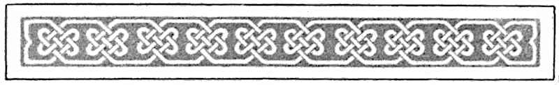
Decoration—Inasmuch as Longfellow means to me, first, the Olaf Saga, my decoration shall be Celtic. There seems to be a peculiar appropriateness in using the Celtic interlaced ornament, for its intricate convolutions, weaves, and knots are said to symbolize the mysterious ways of Providence and his unity of purpose in everything. Longfellow held that faith, although he saw the darker side of the shield.
Technique—Longfellow was a gentleman and a scholar. He respected all the fine conventionalities of life, he upheld the best traditions in thought and speech. What a contrast between his art and that of Walt Whitman! For a Whitman booklet I might use a paper strong and rough in texture, and print the title in green ink! My cover design might be as unconventional as a granite boulder, and my technique as bold as the signature of John Hancock! But for Longfellow my technique must be restrained, temperate, orderly, conventional, refined.
The cover is the “advance agent.” It should win at sight; it should arouse interest in the contents of the book, and suggest its character; it should fittingly protect and recommend the contents, as a frame protects a picture and enhances all its good qualities.
Arrangement.—The problem now is the arrangement of the material for the cover. However it is arranged, the page must be (1) legible and (2) pleasing to the eye.
[Pg 22]
1. Legibility. This means that only easily recognizable letters be used for the title and author’s name. “When in doubt use Roman” is good advice. The style of lettering chosen should echo in some way the style of the text within. If the booklet is to be written freely, in ordinary hand, a free Roman letter, such as Mr. Hall has used in Plate X, is appropriate for the title-page. If the hand is to be more formal, such, for example, as that shown in Plate XI, the title-page should be drawn in such a style as that exhibited in the heading of the plate. In short, what is said about ornamental initials and their relation to the text, on page 36, applies in a general way to the title-page. The title-page may, however, be a little further removed from the text, a little more formal in character than the initial, because it is not so directly associated with the text. Then, too, the title-page is like the outside front door. It first meets the stranger. The introduction demands certain formalities. Once within the house greater freedom may be granted.
Legibility means also freedom from entangling alliances. Text should be text with ample space for itself, and ornament should be ornament within its own field. The two should never quarrel, should never be snarled up together, should never wrestle with each other or compete for first place.
2. Pleasing Appearance. Pleasing appearance in a cover design means four things: (a) The design as a whole must appeal first to the eye. (b) Among the parts of this whole the title should stand first in importance. (c) All the parts should have an orderly relation to each other and to the whole in size and position. (d) This orderly relation involves balance.
Balance means the distribution of attractions with reference to some center. Lines, spots, areas, contrasts, colors all constitute attractions for the eye. These must be so distributed that they balance on the vertical axis of the page, and upon a point in that axis slightly above its geometric center.
[Pg 23]
Plate II.
Three types of cover designs. In the upper row badly arranged; in the lower row well arranged.
Plate II shows the covers of six school reports. The bad ones are in the upper row.
The first does not present itself as a whole. The seal has the first word. The cover below is better in design.
The second has unfortunately four styles of type in three lines (!) where one style would have been enough. The type mass is too low on the page. The cover below it is better.
The third repeats the defect of the first in its seal. Moreover, it is unbalanced. The seal is on the vertical axis, but the type mass is not. If the upper mass is at the left of the central axis, the lower must be at the right. The cover below this is better.
[Pg 24]
Plate III.
Three covers, severe to ornate in character, all well arranged.
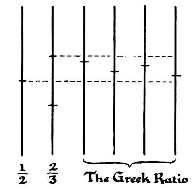
Plate III shows three covers having the Unity, Principality, Order and Balance which characterize pleasing appearance.
The first, unusually free in its handling, is a cover by Mr. James Hall. The second, a little more formal, is by Mr. F. W. Goudy, of New York, one of the best of typographic designers. The third, most formal of all, was composed from type and “stock ornaments” under the direction of Mr. A. A. Stewart, principal of the North End School of Printing, Boston.
But the arrangement of pages shown in Plate III, practically the same in all, is not the only possible arrangement. Plate IV gives nine others. All these illustrate, in one way or another, the application of the most important single law we have for the determining of proportions, namely, the law of the Greek ratio. Briefly stated, it is this: A line or measure is pleasingly subdivided when one part is more than a half and less than two-thirds the length [Pg 25]of the other. It is illustrated herewith. In Plate IV this ratio controls the measures of all the principal subdivisions, comparable lines and margins.
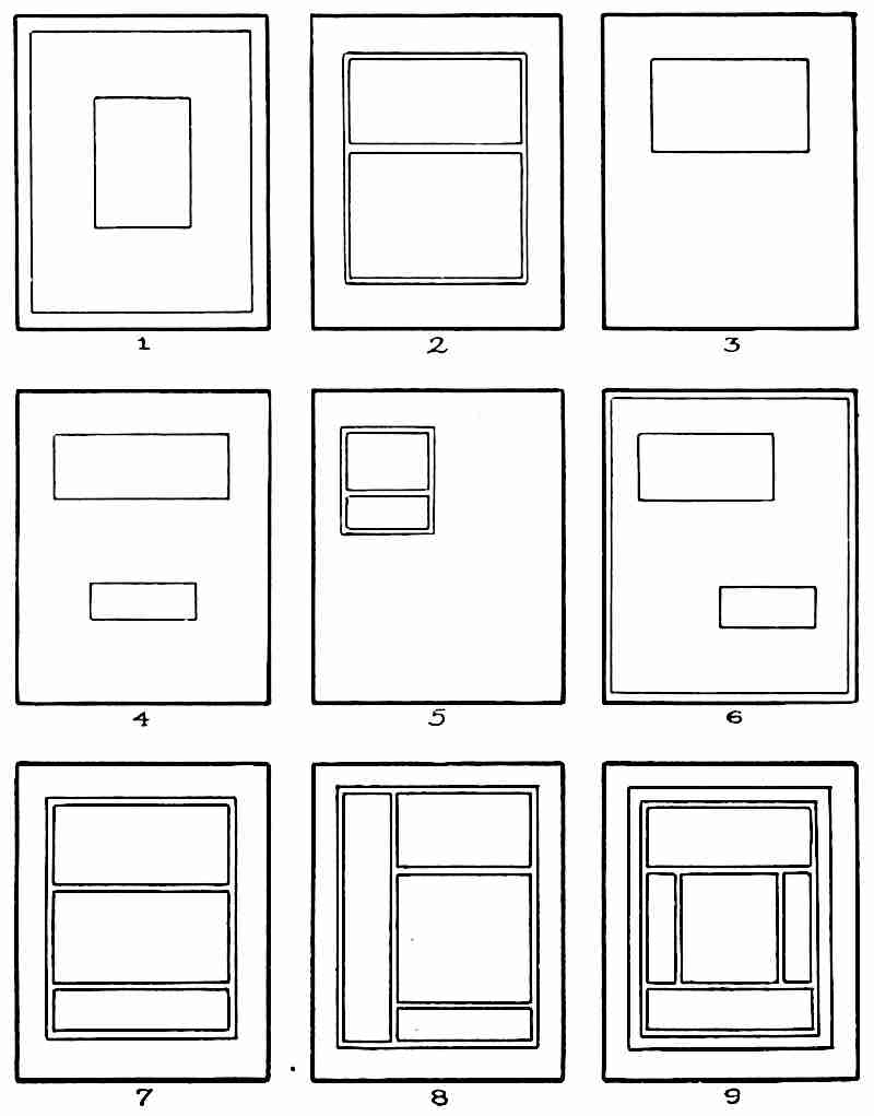
Plate IV.
Nine examples of a lay-out for a cover, from the simplest to the most elaborate children should be allowed to attempt.
[Pg 26]
When the type mass is small, as in 1, the outer rectangle needs to be reinforced, if only by a line parallel to the edge. The same is true when the type masses are freely balanced, as in 6. When a single area is broken up into two or more parts, the parts should be bound together by a circumscribing line, as in 2, 5, 7, 8 and 9. With two evidently independent areas such a line is not required. In 5 the attraction of the large undivided blank area at the lower right is sufficient to balance the small, cut-up area at the upper left.
In subdividing areas regular sequence in position of the various measures should be avoided, for it initiates a movement of the eye in one direction, following the sequence, and disturbs the balance of the whole.
In designing the cover, the scheme finally determined upon should be such as seems best, considering the number of elements to be incorporated. For the Longfellow booklet I decided to use a rather broad Celtic border, therefore none of the nine plans given in Plate IV will do. I must revert to the plan which underlies the covers in Plate III.
Lettering—The selection of an appropriate style of letter is but a preliminary. The drawing of the individual letters in proper relation to each other and to the whole is the chief task, and not an easy one. It is well first to draw on a slip of paper the exact area to be filled with the lettering, and to subdivide it by means of light horizontal lines to indicate the number of lines of lettering required, the spaces between the lines, and the approximate height of each line of letters. Upon this slip trial sketches should be made, in pencil, first roughly sketched, then brought into shape and refined. In good lettering the whole makes its appeal as a mass first. This breaks up into lines, the lines into words, and last of all the words into individual letters. The letters should not attract attention to themselves first, either by their erratic character or by their spacing. Plate V shows the evolution of a line of lettering. Sketched roughly with a single pencil line the first time it fell short. The second time it overran. “The third time never fails.” (It does, sometimes, in lettering!) When the spacing seems about right [Pg 27]in single strokes, try it again in pencil, with the double strokes to indicate the thickness of the different parts of the letters, and to perfect the spacing. The letters should look equably spaced. There is no mechanical rule for such spacing. Only intelligent practice makes perfect. When the line is satisfactorily drawn in pencil on the slip of paper the line is ready to be transferred, by tracing or by copying, to the cover of the booklet, and drawn in ink or water color.
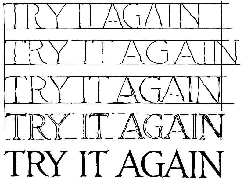
Plate V.
The evolution of a line of lettering.
Having arrived at a clear perception of just how my Idea is to be embodied, and having completed the design for my booklet, I am ready to lead the children to do the same thing for themselves, and then to take the next step.
Ninth, Make the Booklet
With the dummy as guide, the making of the booklet is now an open road.
[Pg 28]
1. Get out the stock. This means the selection of the paper and the cutting of it to the proper size. A smooth, unruled paper of good weight, but not too thick, is best if the booklet is to be done in pen-and-ink, as it should be. The color should be white. In this particular case, my own booklet, I would secure if possible a cream white, to harmonize more closely with my orange scheme of color. Cut the folio sheets to exactly the right size. Cut one or two extra for use in case of need.
2. Lay out the pages. The folios would better be kept flat until the booklet is ready for binding. The place of the fold should be indicated by a pencil line, and the pages should be numbered, very delicately (to be erased later) in pencil, to correspond to the pages of the dummy. Indicate by carefully ruled light lines the widths of all margins throughout the booklet, and the positions of all illustrations. Be sure to allow for proper space between illustrations “in the text” and the text itself. The lines of writing should not bump into the pictures! Study good models—the best school books the children have—to make clear the necessity of proper spacing. Plates VI, VII and VIII give three typical illustrated pages. Plate VI is a portrait of Longfellow, occupying an entire page. The original print[L] was so large that no room was left within the margin lines for even a name. Of course, I might have omitted the margin lines and added the name beneath the portrait, but I concluded to refer to the picture in the text. Everybody knows Longfellow! Plate VII shows how to place two small prints on a page. A page should look balanced and orderly in arrangement. This plate shows also the thoughtful ruling of the page to receive the text. This text is to be “run around” the illustrations, leaving proper spaces between the pictures and the lines of writing. Notice that the lines top and bottom are so placed that when written upon the text will [Pg 32]seem to fill the measure of the page. The “ascenders” of the capitals and other tall letters will come to the top margin line; the “descenders” of the small letters to the bottom margin line. Plate VIII shows a picture clipped from an old Harper’s Magazine , with an appropriate quotation below to properly fill the space.
If ornamental initials are to be used the proper spaces should be left for them in the dummy.
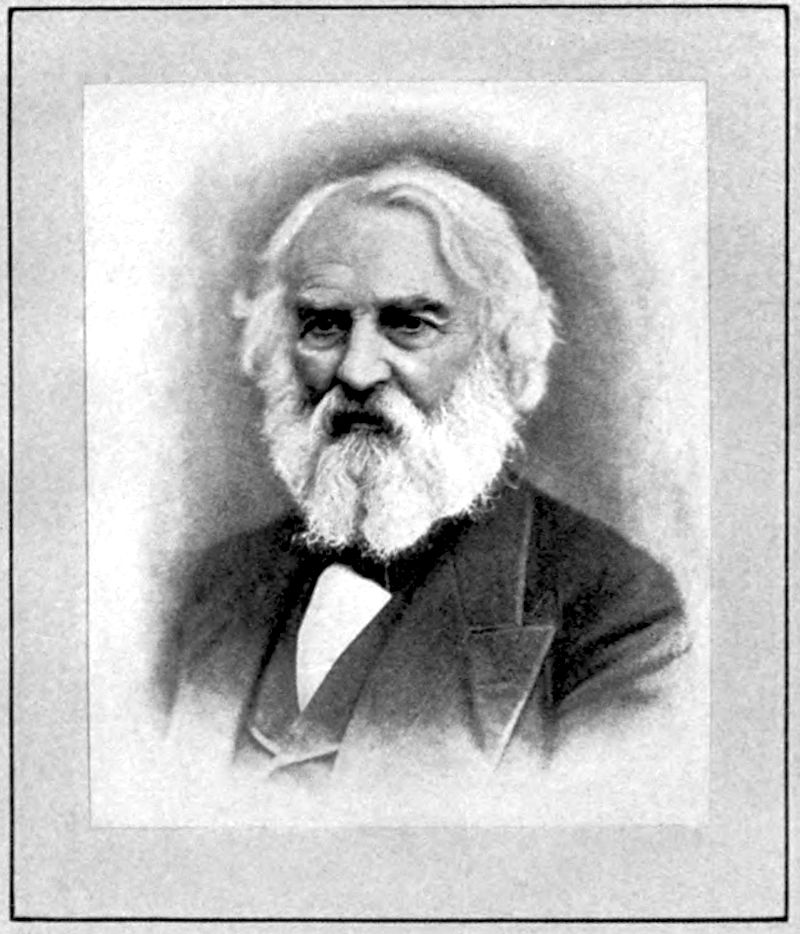
Plate VI.
A full-page plate. A half-tone picture mounted upon a page with a margin line, all well spaced.
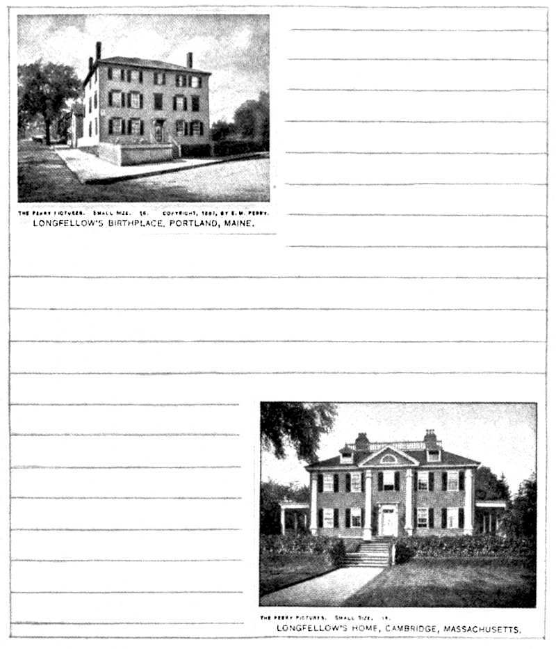
Plate VII.
A page with illustrations in the text. Every page should present a well balanced appearance. Great care must be exercised in ruling, especially in such a page as this, that the whole may present an even distribution of written text.
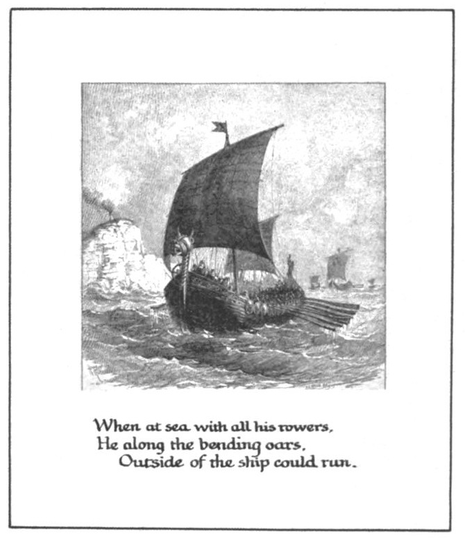
Plate VIII.
A full page, exhibiting a mounted clipping and an appropriate quotation, well spaced within the margin lines.
3. Copy the text. This would better be done at this point, for pupils are more likely to make mistakes in the text than in the illustrations. It is always wise to do first that which offers the largest opportunity for spoiling the page. The style of writing must now be chosen. From an esthetic point of view a vertical hand is best. The axes of the letters rhyme with the vertical edges of the page and the vertical lines of margins and illustrations.
Obviously the easiest and least educational thing to do is to write the text in one’s ordinary hand, without ornamental initials, or any other sign of loving interest in the performance, except thoughtful spacing, as shown in Plate IX. The utmost care should be exercised in keeping the text within the margins. To start, the lines right is comparatively easy; to stop them right is a test of the writer’s foresight and skill. Any form of handwriting admits of expansion and contraction; many words divide happily into syllables; thus the lengths of the lines may be adjusted to the space. Occasionally, in case of necessity, as a last resort, flourishes such as those shown in Plate X may be used.
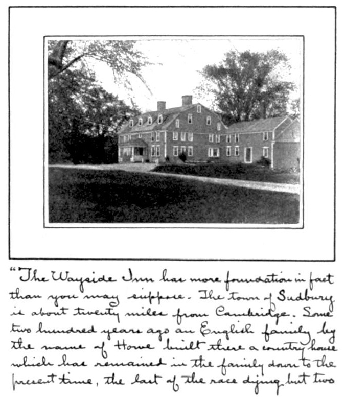
Plate IX.
A full page exhibiting a mounted picture with a portion of text, written in ordinary hand to properly fill the page.
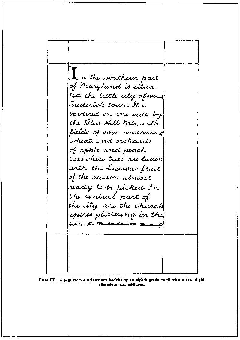
Plate X.
A page from a well-written booklet by an eighth-grade pupil, with a few slight changes, initial, ruled lines, and flourishes, by Mr. James Hall.
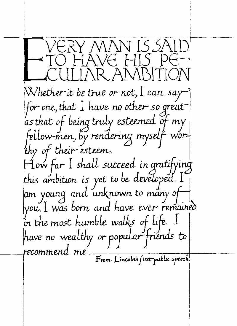
Plate XI.
A page written in a somewhat formal hand, enriched slightly by the addition of color. In the original the large initial “E,” the words “from Lincoln’s first public speech,” and the border lines, were printed in red. The rest of the lettering was in black. The paper used was a deep cream color. By Mr. James Hall.
A richer effect may be produced by the use of color, as suggested in Plate XI, and by the adoption of a more formal hand. Ornamental initials also enrich the page. If the pupils have had any practice in pen lettering and can take the time to complete their booklets in the spirit of the pen craftsmen, the results will be more satisfactory in every way. The style of writing, whatever it may be, should be uniform throughout, and the initials should be in harmony with it. Plate XII gives illustrations of this. In 1 the ornamental initial is merely the script O (see “Olaf”) enlarged, [Pg 36]with a somewhat fanciful “f,” in harmony with it, as a substitute for the capital letter which in print would complete the first word. In 2, where a stub pen held at right angles to the reading line determined the character of letter, the initial corresponds. Compare this initial and text with 3, where the pen was held at an oblique angle with the reading line. All the other initials in Plate XII are appropriate for manuscript pages of different degrees of formality. The initial may always lead the text in general character, be a little more formal, a little more ornate, but it should not be so elaborate as to cheapen the appearance of the text. Moreover, the initials should be of uniform style throughout the booklet and in harmony with the other ornamental details. In the case of the Longfellow [Pg 40]Booklet an initial like 12 would be used, because of its interlacing, in harmony with the Celtic ornamentation of the cover. Plates XIII, XIV and XV are reproduced from originals by skilful craftsmen who have acquired a formal hand of marked character and beauty.
The style of writing, whatever it is, should represent the best of which the pupil is capable, and should “hold up to sample” from first to last.
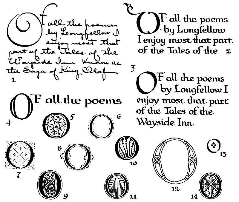
Plate XII.
Initials must be in harmony with the text. Fourteen approved styles of pen drawn ornament, derived from manuscripts, VIIIth to XVIth centuries
Plate XIII.
Example of a good italic hand.
Plate XIV.
Example of a good round hand.
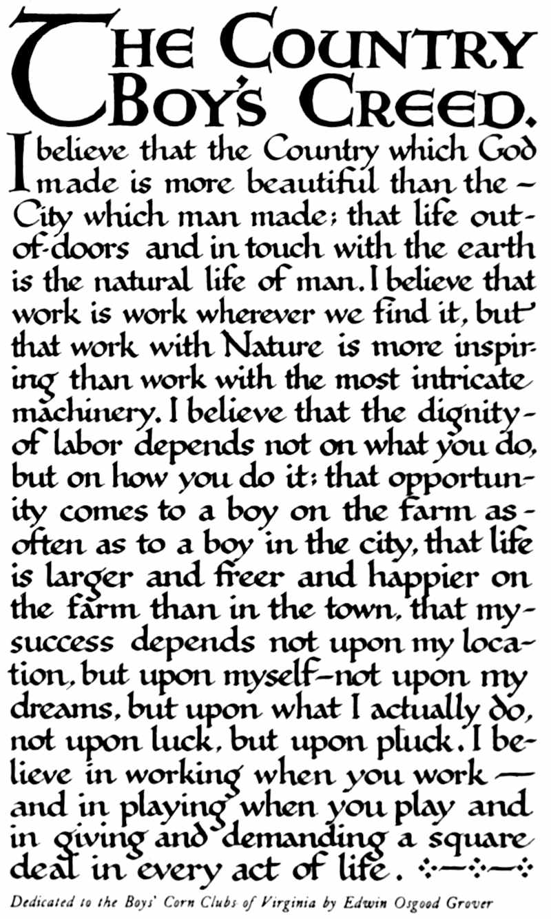
Plate XV.
Example of a formal style of pen lettering, with built-up capitals. The original was hand lettered by George H. Smith and was printed in two colors. The title, “The Country Boy’s Creed,” and the initial “I” were printed in red. The rest of the text was printed in green-black ink. Deep cream paper was used.
4. Add the Illustrations. The ideal booklet is “all of a piece”—all done by hand. If the illustrations are such as can be easily copied, or if they can be original, the whole will be consistent throughout.
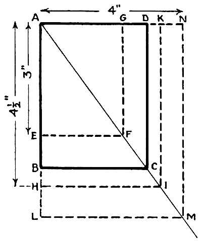
In copying pictures two devices are often of great assistance—the diagonal and the net.
The Diagonal—Let the rectangle A-B-C-D in the diagram represent the shape of picture to be copied. A diagonal drawn in this rectangle will locate corners of similar rectangles. Suppose the size of the picture is to be reduced, let us say, to 3 inches. Measure off the 3 inches on the line A-B, as indicated. Through E draw E-F parallel to B-C and draw F-G parallel to C-D. A-E-F-G is the size and shape of the reduction. Or, suppose the picture is to be enlarged, let us say, to 4½ inches. Measure 4½ inches downward from A on the extension of the line A-B, and find the point H. Proceeding as before, A-H-I-K is the required rectangle. If the width is the known dimension, 4 inches, let us say, to which the picture is to be enlarged, begin with the width as indicated at the top, and proceed as usual. A-N-M-L is the rectangle.
The Net. Divide the picture to be copied into a convenient number of rectangles of equal size, after the manner shown in Plate XVI, first into halves, then into quarters, [Pg 41]and, if necessary, eighths, each way. Number and letter the lines as indicated. Having found by means of the diagonal the correct size and shape of the copy desired, divide that rectangle to correspond, into halves, quarters, eighths, each way, and mark the lines with corresponding figures and letters. If the side of a window falls on line b between 2 and 3 in the original, it must be located there in the copy. If the outline of the mountainside crosses line b half way between the top and line 1 in the original, it must cross the corresponding line in a corresponding place in the copy. By this means every important feature of the picture may be readily located in the copy.
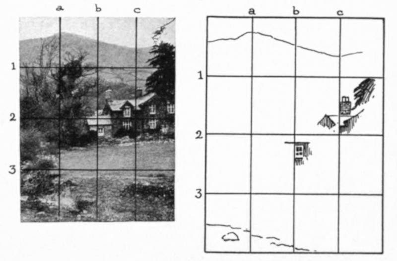
Plate XVI.
The net as a help in reducing or enlarging a picture.
Frequently, copying is inadvisable, and then, as in the case of the Longfellow booklet, some or all of the illustrations must be “tipped in,” as the printers say, which means pasted in by their tips (a top or side edge, or the corners). This should be done neatly, using the least possible amount of the best paste. The sheets should be pasted in such a [Pg 42]way that they will not flap out of position and catch and crease as the leaves are turned.
5. Letter the Title-page. In that admirable book on title-pages by Mr. Theodore L. De Vinne, we are told that every title-page should be planned. “If words are scant the page will be bleak; if it has too many words the lines must be huddled.” A title-page has certain regular divisions—name, author, imprint. It should adequately introduce the reader to the book, the author and the publisher. In the case of a school booklet author and publisher are one. The title-page may then assume such a form as this:
[Pg 43]
The margins should be like those on other pages, the style of lettering should harmonize with that of the text pages and initials, and the whole effect should be dignified. As Mr. De Vinne says: “Compared with the text that follows the title is a trifle, and yet the impression made by it is not to be undervalued. It is the page first inspected, and it attracts or repels at a glance.”
6. Make the Cover. The cover may be of the same paper as the book itself, it may be of the same paper used double, to give a feeling that it serves as a protection to the other pages, but it would better be of a thicker paper and of a different color from the leaves. Of course, it may be of prepared cloth, or leather, or the book may be “bound in boards,” as books “for the trade” usually are. This Longfellow booklet has the form of a pamphlet, a thin book bound in paper covers. This cover has already been designed. (See Page 21 and the following.) The cover paper should be cut to fit the book. The front cover for the Longfellow booklet is shown in Plate XVII. The border is an adaptation of a design given in Owen Jones’s “Grammar of Ornament.” The rosette is from the old baptismal font in Trondhjem, King Olaf’s capital. The lettering is a bit odd, partly because the first word is so long, and partly to hint at interlacing, that all the parts may have something, at least, in common, and thus be harmonious. The back page of the cover affords an opportunity for saying a graceful farewell to the reader, for having the last word, repeating the thing to be remembered, or recalling author or publisher. In the case of the Longfellow booklet I want it to be my hero, King Olaf; therefore I have used (Plate XVIII) the head of an old Norse king, let us call it Olaf, which I found on an advertising pamphlet for “Danish Bond” paper.
Plate XVII.
Front cover of a Longfellow Booklet, making use of Celtic motives as appropriate for an essay emphasizing the poet’s Saga of King Olaf.
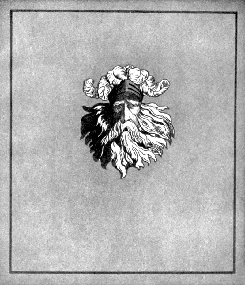
Plate XVIII.
Back cover of a Longfellow Booklet, with a decoration which serves as a farewell token of one of the poet’s heroes, King Olaf.
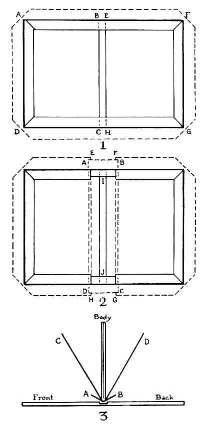
Plate XIX.
Simple bindings of cardboard and paper or cloth.
7. Bind the Booklet. The binding material should be unobtrusive. That which is chiefly structural, a necessary but entirely subordinate element, should not be allowed to usurp first place, as it is sure to do if ribbon or a tasseled cord or brilliantly dyed raffia is employed. A stout thread, [Pg 46]as nearly as possible the color of the cover, or at least in close harmony with it, is to be recommended.
To bind the booklet, thread a needle with the binding cord; partly open the booklet at the middle, and from the inside thrust the needle through the center of the back; return the needle through the back about half way to the top of the cover; pass it again through the back, this time half way between the center and the foot of the cover; return the needle through the central hole; tie the two ends of the thread together, over that part which lies in the crease. Be sure to tie a square knot, one that will not slip.
Should a more substantial binding be desired, proceed as follows:
Add extra fly leaves or end papers to the pamphlet.[M]
1. Cut two pieces of cardboard the size of the pamphlet pages, plus an eighth inch at top, bottom and one side—A-B-C-D and E-F-G-H, Plate XIX, Fig. 1. Place these [Pg 47]side by side, as far apart (B-E and C-H) as the thickness of the pamphlet. Cut a sheet of cover paper three-quarters inch larger all around, as indicated by the dotted line, A-F-G-D. Clip off the corners as shown in the diagram. Remove the cardboards and paste the covering sheet all over. Replace the cardboards, rub them down hard, fold over the edges, top and bottom first, then the sides, and rub these down hard. The pamphlet may now be fastened into the covers by sewing through the back and by pasting down the end papers, C and D, Fig. 3, to the inside of the covers front and back. In a small pamphlet the pasting of the end papers may be sufficient to hold the book together.
2. To bind in cloth or leather and boards, having gotten out the two pieces of cardboard as before, cut a strip of cloth or leather of the desired width, A-B-C-D, Fig. 2 (it should lap on three-quarters inch at least), and secure the boards to it by means of paste, folding over the ends as indicated by the full and dotted lines at I and J. Get out the cover papers. These are like the cover paper in 1, with a strip cut out of the middle, as indicated in diagram 2 by the letters E-F and G-H. The edges E-H and F-G should lap over the back strip an eighth inch or more. Paste the cover papers and rub down the laps. Insert the pamphlet and fasten it in as before.
3. The blind sewing-in of the pamphlet is effected by adding to its back outside the end papers C and D, Fig. 3, a strip of stout linen or other tough material, A-B. This should not be longer than the distance from the lap I to the lap J, in Fig. 2, and should be added, of course, when the body of the book is sewed. Secure the body of the book within the covers by pasting this back strip A-B to the front and back covers. When this is done, paste down the end papers.
Tenth, Give It Away
From the first the children should be taught that service is the end of life. They should serve each other, help the teacher, coöperate in school tasks, and actively participate [Pg 48]in developing a fine school spirit. The booklet should be made for somebody at home, some friend, or for exchange with some pupil in a distant part of the country. It should never be retained by the pupil who made it (there may be exceptions to this), because as soon as it is done its value to the maker ceases. He ought for his own good to forget the things that are behind, and press forward to better things. He should not be allowed to hoard and gloat over his small triumphs.
When the booklets are completed hold a “private exhibition” of them, discuss them freely, note the defects, the chances for improvement next time, and also the successes, and then, having squeezed out of them all the educative value, all the delight of doing, all the pleasure of seeing one’s own good work, send them, with a gracious little note, to those for whom they were made, and thus extort from them their last and best gift, the blessedness of giving.
[A] The issue for November, 1906, for example, contains a good primary booklet and a good grammar booklet. Subject, Thanksgiving.
[B] That is teaching.... The class is free to suggest, free to choose, but is led skilfully to see for itself the wisdom of choosing a certain line of action. That line of action was foreseen as best by the teacher, and, therefore, was foreordained (excuse the theological terms). Of course, the class was not aware of that. How can children discover what is best for themselves without a good teacher?
[C] Go to some well-to-do citizen of your acquaintance, tell him just what you want for the children, and ask him to give you the money to buy it. The amount will be small, but the satisfaction to the children and to himself will be great. The children will make him a special booklet, dedicated to him as their helper. It shall be made by the best workers in the school. In twenty-five years I have never been refused when I have asked anything for the children.
[D] In place of copyright notice or printer’s imprint, a brief statement of where and when the booklet was made may be inserted here, or the monogram or totem of the maker, or a line of dedication.
[E] A folio is simply a sheet of paper folded to make two leaves, four pages.
[F] The problem of margins is treated at length in “Writing and Illuminating and Lettering,” by Edward Johnston.
[G] A “vertical” page has its long edges upright and is bound on a long edge. A “horizontal” page has its long edges horizontal and is bound on a short edge. The vertical page is the common form, and should be adopted except in rare cases where the horizontal seems unavoidable.
[H] Recto is the term used by book makers to indicate the right-hand page of an open book; verso the left-hand page—the reverse side of a recto.
[I] From “The Features of a Printed Book,” published by the School of Printing, North End Union, Parmenter Street, Boston.
[J] “Self-Cultivation in English,” by George Herbert Palmer, is a brief and illuminating essay bearing upon this topic.
[K] “Familiar Quotations,” Bartlett; “Book of Quotations,” Benham, and works of similar character will aid in determining popular poems.
[L] A “Perry Picture.” I am indebted to Mr. Eugene A. Perry, of Malden, Mass., for permission to use this portrait, the print of the Longfellow Monument, of the Wayside Inn, and of the two Longfellow Houses (all copyrighted by the Perry Pictures Company).
[M] End papers are ornamented fly leaves. In commercial books each is a folio, one leaf of which is pasted to the cover, and the other, by a narrow strip of paste along the back, to the adjacent fly leaf. End papers, if decorated, have the design on one side only, the side not pasted. The decoration should be in harmony with the subject matter and make-up of the volume.
Transcriber’s Notes
Obvious typographical errors and punctuation errors have been silently corrected after careful comparison with other occurrences within the text and consultation of external sources. Except for those changes noted below, original spelling in the text has been retained.
Page 42: “Theodore L. DeVinne” replaced by “Theodore L. De Vinne”.
Page 43: “Mr.DeVinne” replaced by “Mr. De Vinne”.